Exhibition: Juergen Teller

jurgen teller

Juergen Teller, Lehmann Maupin, New York
10 February -17 March 2012 201 Chrystie Street

This exhibition highlighted three recent series, demonstrating Teller’s dynamic and diverse oeuvre. Featuring the controversial photographs of Kristen McMenamy, shot in the home of Carlo Mollino and seductive portraits of Vivienne Westwood, juxtaposed with intimate portraits of his family and close friends, this exhibition displays an amalgam of subjects and personalities. Drawing inspiration from the eccentric architect, Teller recalls Mollino’s fascination with the erotic, capturing McMenamy in provocative poses. Although the series garnered controversy for its alleged “pornographic” nature, it demonstrates Teller’s skilled storytelling and fearless approach to his medium. Composed of recent photographs taken in and around his home in Suffolk, photographs from the series, “Keys to the House,” includes deserted landscape shots and intimate portraits of Teller’s family and closest friends. The third series, “Men and Women,” includes portraits of Vivienne Westwood and photographer William Eggleston, as well as Teller’s son, Ed. As a whole, the series has been read as a representation of masculinity at two stages, coming of age and loss of virility, contrasted with a strong feminine power.

Born in Erlangen, Germany in 1964, Juergen Teller studied at the Bayerische Staatslehranstalt für Photographie in Munich, Germany before moving to London in 1986. His work in influential international publications such as W Magazine, I-D and Purple nurtured his own photographic sensibility, which is marked by his refusal to separate the commercial fashion pictures and his most autobiographical un-commissioned work.
Read Full Article

Renee So

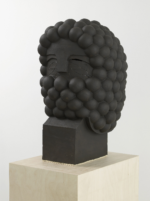
renee soBellarmine X, 2012 ~ glazed ceramic, birch plywood, 47 x 50 x 50 cm

Renee So, Bellarmine IX, Bellarmine X and Untitled, 2012

With their penchant for drunken acrobatics and big jolly beards, the characters Renee So brings to life are a lovely gang of odd bods. In the giant “knitted portraits” she creates on a 1970s pre-computerised machine, her figures – who wear ballooning Elizabethan trousers and top hats and carry canes or clay pipes – seem to have been rummaging in history’s dressing-up box. Meanwhile, their flat, 2D forms and rigid poses resemble ancient tapestries, friezes and cartoons all at once.

They have coloured beards that cover their mouths like bubble bath foam. Their eyes are mysterious – are they laughing or glaring? So’s ceramic busts are similarly intriguing. Their hair is made from Malteser-like brown orbs, and their masks resemble Roman helmets. Some have double heads, like kings in a pack of cards; some wear hats. They’re comic and stoic, taking our smiles with dignity.

Born in Hong Kong and raised in Australia, So’s earlier work addressed her dual heritage. A self-confessed “craft nut”, she turned to knitting to create images that referenced tourist export chinoiserie and its trade routes. Since moving to London in 2005, she’s looked at the history of European sculpture, both grand and humble. While her masked ceramics suggest armoured soldiers and curly-haired Caesars, she also uses pottery to portray a more knavish people’s hero: Bartmann.

She discovered Bartmann, or Bellarmine, stoneware in the V&A and was immediately hooked by its convoluted history. First brought to Britain from Germany in the 1500s, Bellarmine beer jugs double up as depictions of bulbous bearded men, descendants of the Wildman of medieval folklore. Their name is a jibe at an unpopular cardinal who condemned drinking. They were a sure-fire hit, and their fame mushroomed.

So sets this figure free from his roots as a mass-produced beer mug. In her sculptures and knitted portraits, we glimpse surreal transhistorical tales where dandies, drinkers, kings and soldiers are one and the same. Inviting us to imagine the backstory, these inscrutable bearded and masked players show that identity is a shifty business, built on tangled traditions and stereotypes.

Read Full Article

Photographer: Ed Panar

For the most part, his subtle color photography has mined the territory of what he calls “the edges or background of the human scene.” His 2007 book “Golden Palms,” a study of Los Angeles, exemplifies this approach: the photographs hone in on the patterns or textures of objects. For Panar’s photos, the light falling on the hood of a car, or the way a plant grows through concrete, holds as much meaning as the people who live with these things. In fact, he almost never photographs people, which has made his work fairly abstract.

Panar studied photography in school, and has found an appreciative audience for his quiet photographs, but his new book, “Animals That Saw Me,” seems bound for wider acclaim. “Animals” (published next month by The Ice Plant) does exactly what it says on the cover: each photo is a memento of an extra-human encounter. He says it’s his “tribute to living beings,” and if you can pick up on the humor in that statement, you’re on the right track.
Panar takes a light approach to his work, which extends all the way to the CV section of his website, which may include the best jokes on the photography internet—if you can find them. While there’s clearly something funny about faux-portraits of animals, Panar also sees his more abstract photos in the same humorous way. In this interview, he talked about his editing process, the relationship between his different projects, and why “Animals That Saw Me” could help explain all of his other work.

Placing equal weight on editing as well as shooting allows Ed Panar to fully explore the potential that his images have when contextualised. Individual images work together to produce everything from humour to reflection within the viewer. The idea here is not that the images compliment one another to clarify the subject matter at hand, but rather that they work together to resist one simplistic reading. To look at Ed Panar’s pictures over and over again, is to learn something new each time, both about the photographer and also the places he photographs.

Read Full Article

Anselm Reyle

Untitled, 2008. Mixed media on canvas, acrylic glass

Anselm Reyle was born in Tübingen, Germany in 1970. He currently lives and works in Berlin.

Reyle’s stripe paintings are instantly recognizable as responses to the formalist vocabulary of Clement Greenberg that defined the art of the 1950s and 1960s. Reyle references iconic abstractionists ranging from Kenneth Noland to Otto Freundlich. Reyle’s “objets-trouvés,” a reference to his multi-media installations that include sculpture and found neon lights, are in constant dialogue about the role of modernism today.

Reyle’s critique of painting extends to his exploration of the constantly shifting criteria required for a work to be considered complete. He is one of few contemporary German painters examining the lessons of abstraction and their place in contemporary painting at a moment when figurative painting has gained critical momentum.

Read Full Article

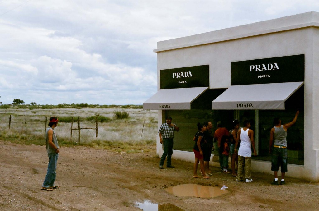
Prada Marfa

Marfa-35mm-029

Elmgreen and Dragset, Prada Marfa, 2005

Prada Marfa is a permanently installed sculpture by artists Elmgreen and Dragset, situated 2,3 km northwest of Valentine, Texas, just off U.S. Route 90, and about 60 km northwest of the city of Marfa. The installation was inaugurated on October 1, 2005. The artists called the work a pop architectural land art project. The sculpture, realized with the assistance of American architects Ronald Rael and Virginia San Fratello, cost US$80,000 and was intended to never be repaired, so it might slowly degrade back into the natural landscape.

Designed to resemble a Prada store, the building is made of adobe bricks, plaster, paint, glass pane, aluminum frame, MDF, and carpet. The installation’s door is nonfunctional. On the front of the structure there are two large windows displaying actual Prada wares, shoes and handbags, picked out and provided by Miuccia Prada herself from the fall/winter 2005 collection. Prada allowed Elmgreen and Dragset to use the Prada trademark for this work. Prada had already collaborated with Elmgreen and Dragset in 2001 when the artists attached signage to the Tanya Bonakdar Gallery in New York City with the false message “Opening soon – PRADA”.

Read Full Article

Cindy Sherman: Retrospective

cindy sherman

Cindy Sherman: “Untitled #465”, 2008, C-Print, 161,9 x 145,4 cm

Cindy Sherman, Retrospective, February 26-June 11, 2012
The Museum of Modern Art, New York

Throughout her career, she has presented a sustained, eloquent, and provocative exploration of the construction of contemporary identity and the nature of representation, drawn from the unlimited supply of images from movies, TV, magazines, the Internet, and art history.

Working as her own model for more than 30 years, Sherman has captured herself in a range of guises and personas which are at turns amusing and disturbing, distasteful and affecting.

To create her photographs, she assumes multiple roles of photographer, model, makeup artist, hairdresser, stylist, and wardrobe mistress. With an arsenal of wigs, costumes, makeup, prosthetics, and props, Sherman has deftly altered her physique and surroundings to create a myriad of intriguing tableaus and characters, from screen siren to clown to aging socialite.

http://www.moma.org/interactives/exhibitions/2012/cindysherman/

Read Full Article

Oliver Laric

Oliver Laric, Kopienkritik, 2011, Skulpturhalle Basel

Oliver Laric’s work seeks to parse the productive potential of the copy, the bootleg, and the remix, and examine their role in the formation of both historic and contemporary image cultures. This process is intimately tied to his intuitive, idiosyncratic brand of scholarship, which he presents through an ongoing series of fugue-like expository videos (Versions, 2009—present), and further elaborates through his appropriated object works, videos, and sculptures, all of which are densely conceptually layered and often make use of recondite, technologically sophisticated methods of fabrication. Straddling the liminal spaces between the past and the present, the authentic and the inauthentic, the original and its subsequent reflections and reconfigurations, Laric’s work collapses categories and blurs boundaries in a manner that calls into question their very existence.

Laric (born 1981 in Innsbruck, Austria) lives and works in Berlin. He studied at the Universität für angewandte Kunst Wien. Laric’s first solo exhibition in Germany ‘Be Water my Friend’ took place at Tanya Leighton Gallery, Berlin in 2012. His video work ‘Versions’ (2012) premiered at Art Statements, Art|43|Basel (14-17 June 2012). Recent solo and group exhibitions include: alienate/demonstrate/edit, Artspace, Auckland (2012); Villa du Parc Centre d’art Contemporain, Annemasse, France (2012); In Other Words, NGBK, Berlin (2012), Lilliput, High Line, New York (2012); Frieze New York (2012); Kopienkritik, Skulpturhalle Basel (2011); Based in Berlin (2011); You don’t love me anymore, Westfälischer Kunstverein, Münster (2011); Frieze Projects, Frieze Art Fair, London (2011); Music for Insomniacs, Proyectos Monclova, Mexico D.F. (2011); Priority Moments, Herald Street, London (2011); Memery, Mass MoCA, (2011); Frame, Frieze Art Fair, London (2010); Artists’ Video, Vancouver Art Gallery (2010); The World is Flat (curated by Lauren Cornell), X-initiative, New York (2009); Unmonumental, New Museum, New York (2008). Forthcoming group shows include: Detours of the Imaginary (curated by Julien Fronsacq), Palais de Tokyo, Paris (2012); The Imaginary Museum (curated by Bart van der Heide), Kunstverein München (2012); Museum of the Image, Breda, The Netherlands (2012).

Read Full Article

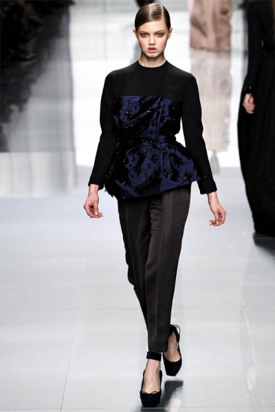
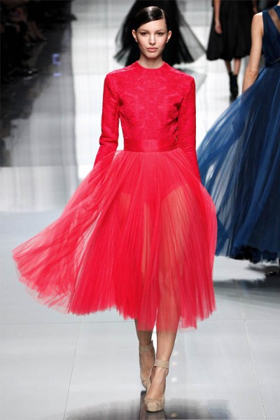
Bill Gaytten for Christian Dior, Fall 2012; New Look

dior46-400x600 dior54-400x600

Bill Gaytten for Christian Dior, Fall 2012, Paris, 2 March 2012

The Christian Dior show today was a frustrating experience. The dither that has surrounded Dior since John Galliano’s departure demands resolution, if only because you never again want to hear one single morsel of groundless speculation. With Dior’s couture collection in July, it felt like Bill Gaytten was courting resolution by laying out his very capable wares. With today’s show, it felt like he was putting them away again.

“Soft modernity” was Gaytten’s theme. It was a notion whose nebulosity dogged the catwalk, where deflated New Look looks simultaneously evoked Dior’s stellar past and its lunar (as in moonstruck) present. The show began well enough. The focus was on the waist—well, it would be, wouldn’t it?—emphasized by a peplum’s flare or a skirt’s fullness.

Classic portrait necklines were literally twisted in leather. Equally classic houndstooth was exploded into an abstract pattern. The models’ knit skullcaps were a streamlined touch. But then, where, in the past, you might have expected takeoff from such a restrained start, there was just more of the same. Perhaps there was some well-reasoned commercial point to that—and rumors suggest the label has been doing fine under Gaytten—but it felt like Dior by the numbers.

Program notes mentioned “a ballet femininity,” and the full silk tulle skirts that made up the collection’s evening component had a feel for that (particularly a shorter-skirted, long-sleeve raspberry outfit), but there was an intangible lifelessness to the clothes.

Maybe it all comes back to the peculiarity of Gaytten’s challenge. How do you muster enthusiasm for your work when you have no clue what tomorrow may bring?

Read Full Article

Bojan Šarčević, At Present, 2011

BS_2011_Raum2_VI_1-800x600

Bojan Šarčević, She, 2010, Onyx, 184 x 124 x 40 cm and installation view of the exhibition At Present, 2011

‘Space is the remains, or corpse, of time; it has dimensions’, wrote Robert Smithson in 1969, a definition highly appropriate to the 76 small collages, arranged together in small groups, that made up this show by Bosnian artist Bojan Sarcevic. Each collage starts with a small black-and-white photograph of a 1950s Modernist interior (or occasionally exterior) of the type found in architectural journals of the time. But their calm, orderly surfaces are disrupted by a tumultuous play of geometric shapes that redistribute details of shade and form as if infected by an anti-Modernist poltergeist. A sweeping staircase dissolves into a froth of tumbling circles; an empty auditorium is invaded by a flock of swooping triangles; the whole façade of a country house spins in a kaleidoscope of interlocking hexagons until barely discernible. Sarcevic’s trick is simple – he has cut the shapes out of the photographs, rotated them or swapped them around and inserted them seamlessly back in. But even when you are aware of this painstaking and repetitious process the results are baffling, various and extremely seductive.

The collages’ vague sense of time and place is located somewhat more precisely by their title, 1954 (all works 2004), which refers to the 1954 edition of the German architectural journal Baumeister, from which the pictures are taken. Germany in 1954, after two lost decades and the horrors of war, was tentatively starting to rebuild its traumatized national morale (helped in no small measure by the country’s unexpected World Cup victory that same year.) And, despite the absence of the country’s greatest modern architects, Walter Gropius and Ludwig Mies van der Rohe, architecture flourished in the steady rebuilding of cities reduced to rubble by Allied bombing, and was characterized by a cautiously optimistic Modernism. This was the year that Mies began his monumental Seagram building in New York, but the pictures Sarcevic collects here are more modest examples of a socially oriented Modernism, felt at the time to be not only an expression of, but also a form of active participation in, the creation of Germany’s new democracy. There is, however, not a single person to be found here, in these static, polished rooms. Like Smithson’s corpse, the spaces are frozen memorials to a past time, fixed in a pristine state of endless anticipation. Who knows if they were ever inhabited, and what they look like now? In Sarcevic’s hands it is as if the wear and tear of human use have been replaced by the unruly spirit of a fermented formalism that rearranges particles at whim.

There is a strong relation to Russian Construct-ivism here. Some of the collages look as if space itself has been fanned out into a hanging Rodchenko spatial construction, while a group of three terribly fragile sculptures on the gallery floor, tiny spiralling structures of sandblasted glass plates held together with tape, could be miniature versions of Vladimir Tatlin’s Monument to the Third International (1919). They also seem to point towards an integration of art into the everyday, as propounded by the Constructivists in Aleksander Rodchenko’s slogan: ‘Work in the midst of everything and with everybody.’

Read Full Article

Wade Guyton

Wade Guyton, Untitled, 2007

It’s amazing that you can become one of the leading artists of your generation by messing with the limits of a home-office printer. That’s what 37-year-old artist Wade Guyton has managed to do ink-wise in the past decade.
Going from paper to linen, running, or rather, pulling, gigantic swathes of fabric through the ink-jet printer while it reads from a computer file, Guyton lets the printer cause the aberrations and pattern glitches that run across his muddy canvas.

Over the past decade, New York–based artist Wade Guyton (b. 1972) has pioneered a groundbreaking body of work that explores our changing relationships to images and artworks through the use of common digital technologies, such as the desktop computer, scanner, and inkjet printer. Guyton’s purposeful misuse of these tools to make paintings and drawings results in beautiful accidents that relate to daily lives now punctuated by misprinted photos and blurred images on our phone and computer screens. Comprising more than eighty works dating from 1999 to the present, Guyton’s first midcareer survey features a dramatic, non-chronological design in which staggered rows of parallel walls confront the viewer like the layered pages of a book or stacked windows on a monitor. The exhibition includes paintings, drawings, photography, and sculpture, and concludes with two spectacular new canvases, stretching up to fifty feet in length, which Guyton created specifically for the Whitney’s Marcel Breuer–designed building. The title, Wade Guyton OS employs the common acronym for a computer’s “operating system,” linking Guyton’s art to the technologies of our time.

Read Full Article