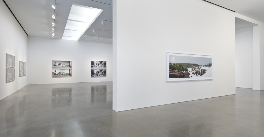
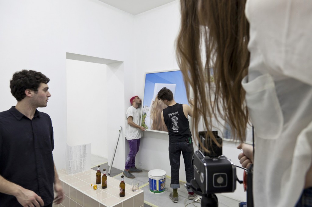
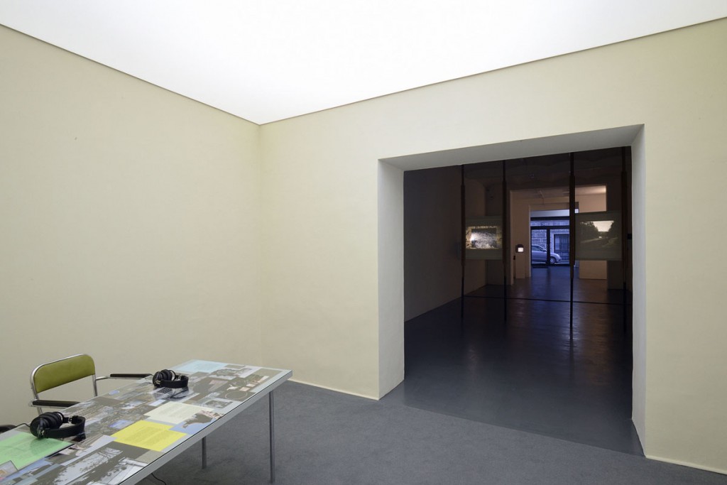
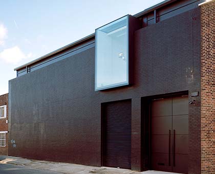
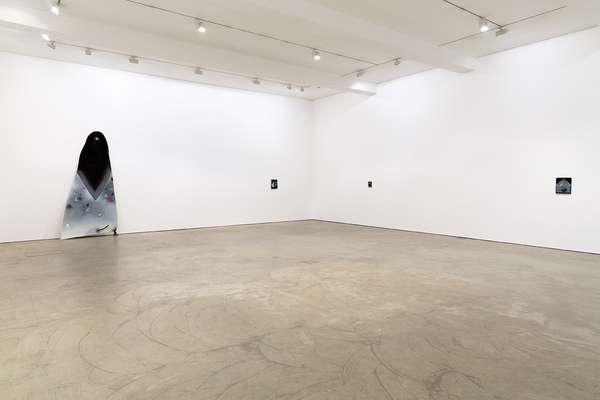
Gallery: Regen Projects, Los Angeles

2b917c15a95c47e2a420e3278cf06efe

8330a80f1e573d82dec0f832ab9819dc271e18de86a53c1cb7dd880cf51d276a

“I knew about the gallery before I ever moved to the United States,” says Philippe Vergne, director of the Museum of Contemporary Art who first landed in the U.S. in 1990s. “If you look at the Los Angeles art scene, Regen Projects, together with a handful of galleries, was really the organization that promoted artists working here from my generation. They represent a group that has been extremely important: Liz Larner, Raymond Pettibon and Cathy Opie, who has been a very important to MOCA not only as an artist but as a member of the board.”

This is the gallery that gave the California-born Barney his first solo gallery show in 1991, when the artist was all of 24. And it was the first to represent L.A. artist Opie, whose elegant portraits of drag kings and S&M fetishists from the 1990s sent a gender-ambiguous lightning bolt through the world of contemporary photography. In 2004, the gallery served as the site of Glenn Ligon’s first solo gallery show in Los Angeles, an exhibition of his gritty text paintings, which borrow passages from a vast array of cultural figures, from Ralph Ellison to Richard Pryor.

The story began in the late 1980s, when Shaun Caley met Stuart Regen at an opening at the Los Angeles Municipal Art Gallery. Regen was part of an art dynasty, the son of prominent New York dealer Barbara Gladstone. He had worked at the experimental PS1 art space in New York (now part of the Museum of Modern Art) and later served as the director of the Fred Hoffman Gallery in Santa Monica. Caley, an art critic, had just landed in L.A. after a stint in Milan, where she’d served as managing editor of the magazine Flash Art. The two met for lunch. Regen offered Caley a job directing his soon-to-be-opened gallery.

“Stuart had always wanted to have an art gallery,” says Caley Regen, and the ’80s provided just the right confluence of happenings in Los Angeles. “There had been the opening of MOCA and the Broad Foundation. And there was a cluster of interesting galleries: Margo Leavin, Fred Hoffman and Daniel Weinberg.”

“We came to the idea that it would be an exciting venture and it was that simple,” recalls Weiner, who says the couple’s seriousness persuaded him that it would be the right thing to do. “It will sound pretentious, but they talked about the work and how it set a tone for the people they were trying to attract. I’d been showing in Los Angeles since the ’60s. I have very dear friends who I made projects with, from DeWain Valentine to Ed Ruscha. They saw me as an integral part of Los Angeles culture.”

A string of important shows followed: a light exhibition by James Turrell, prints by the innovative German painter Gerhard Richter and participation in a three-gallery tribute to Nicholas Wilder, an L.A. dealer who had helped foster the careers of painter David Hockney and minimalist sculptor John McLaughlin.

The gallery’s biggest coup, however, came in May 1991, with the first solo gallery exhibition by Barney, who would become one of the definitive artists of the decade. The show was a fusion of performance, sculpture, installation and photography. There were objects related to sports (a football jersey) and sex (bondage belts), as well as a metal cooling chamber that harbored an exercise bench sculpted out of petroleum jelly. The exhibition was a surreal examination by the former athlete of the cult of the body in relation to athletics.

“Stuart had seen his work in New York and was blown away,” remembers Caley Regen. “It was indescribable, so protean. He was using materials people hadn’t used: medical things, sports things, the body. I thought it was amazing.”

The show received a glowing write-up in industry bible Artforum. Kristine McKenna, who reviewed the show for this paper, described it as “rivetingly weird,” an installation that drew vital attention “to the complex and fragile interplay between spirit and flesh.”

“You put these things out in the world,” she says. “If you show great art, people will come to you.”
http://www.regenprojects.com
Read Full Article

Seventeen Gallery, London

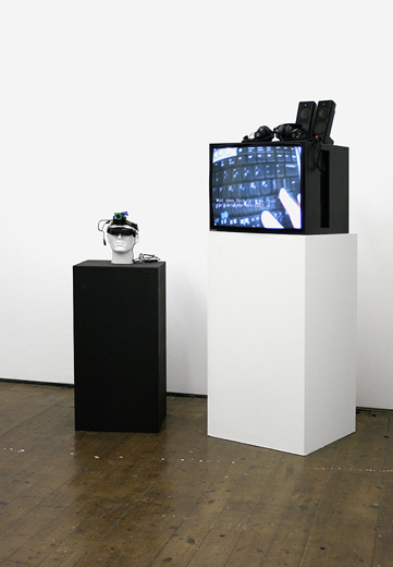
Paul-B-Davis-Critical-Space-HeadgearIMiller-Urey-Version-2

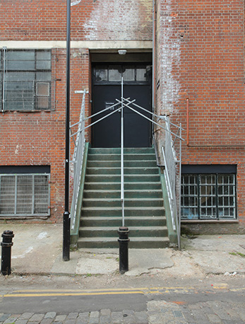
seventeen_outside-crop

Co-founder of Seventeen Gallery, Hoyland, came to London from Shropshire to study at Chelsea College of Art & Design. “I wanted to be a ground-breaking performance artist.” Instead, in the late 1990s he went to work at Coskun Fine Art in Knightsbridge, run by Gul Coskun: “High heels, short skirts and Warhols. The hardest-working woman I’ve ever met.” Inspired, he opened Seventeen in 2005 with Nick Letchford, who he’d met two years earlier in a Hoxton bar. Specialising in video, the gallery on Kingsland Road represents nine artists, including sculptor Susan Collis and Oliver Laric.
How do you find artists?
“I meet them in the pub. Finding artists is easy, finding people you like is harder.”

What kind of work catches your eye?
“Detailed work with lots of labour involved. I like artists to bleed for it and to see that problems have been overcome.”

What’s been the highlight so far?
“Being a gallerist is self-indulgent; it fulfils your art needs and is emotionally easier than being an artist. You get all the cream without any risk.”

http://www.seventeengallery.com/

Read Full Article

Tanya Leighton Gallery, Berlin

LEIGHTON_BOSHIER_CHANGE_13 1_MG_9903_400130225_Smith_002b-copy_web

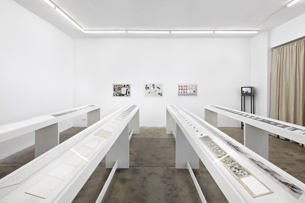
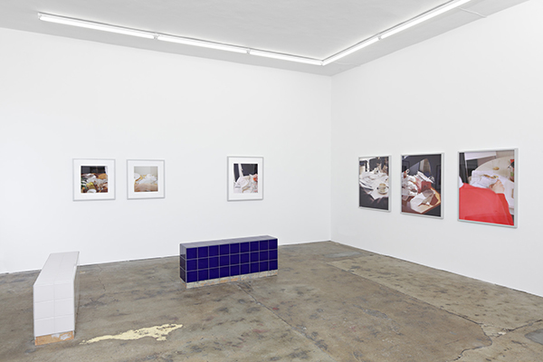
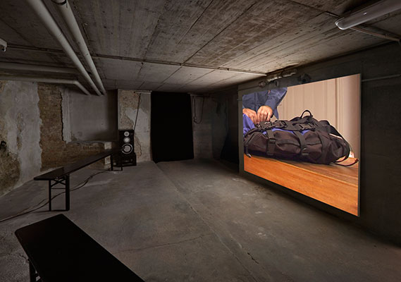
Tanya Leighton Gallery, Berlin, established in 2008, is dedicated to developing a cross-disciplinary, trans-generational gallery programme with off-site projects, in collaboration with artists, filmmakers, critics, art historians, and curators. Its international exhibition programme reflects a variety of opinions and practices as well as Leighton’s associations with American and British experimental cinema, artist’s film and video, performance, minimal and conceptual art.

Solo exhibitions by established and emerging artists intersperse with conceptually-motivated group exhibitions and projects. The gallery engages in the re-examination of historical frameworks and practices, in order to bring marginalized figures, objects, events and contexts back into focus. Gallery exhibitions and events have presented and restaged historical works by artists, filmmakers, and designers such as unsung hero of British avant-garde cinema John Smith, Chinese-American painter David Diao, British conceptual artist Bruce McLean, and Italian master designer Enzo Mari. Leighton also produces and exhibits new and recent work by artists from North America, Austria, Britain, China, Colombia, Czech-Republic, Germany, Palestine, Russia, Slovenia, Switzerland and Uruguay – including Ayreen Anastas, Pavel Büchler, Alejandro Cesarco, Aleksandra Domanovic, Rene Gabri, Sharon Hayes, Sanya Kantarovsky, Oliver Laric, Dan Rees, Lucas Ospina, amongst others.

A series of events at the gallery and at off-site locations have included performances by Norwegian musicians Nils Bech and Bendik Giske, Bulgarian artist Voin de Voin, British artist Ian White, and American artist David Levine. A special Artists Edition Series offers exclusive artists editions coinciding with the exhibitions and events. The first of the series includes new editions by: Matthew Buckingham, Douglas Gordon, Sharon Hayes, Anthony McCall, Martha Rosler, and John Smith.

http://www.tanyaleighton.com/main.php#exhibitions

Read Full Article

T293 Gallery, Naples and Rome

ins1 MACA42-4-1400x933 T293_TRVM_11

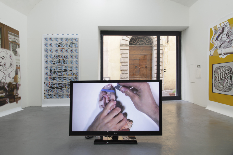
Established in 2002 in an historical building of the Neapolitan centre, in Via dei Tribunali 293, T293 has always been characterised by a keen awareness on artistic practices that are both experimental and conceptually relevant to the current discourse in the field. First conceived as artists’ space dedicated to the support of emerging artists, in 2006 T293 changes its organizational status and starts operating as a company managed by the founder Paola Guadagnino and the independent curator Marco Altavilla, who joined as co-Director.

With the new organization, new purposes have been added, expanding the gallery’s mission towards a more international approach and a more incisive curatorial attitude. With the firm intention to honour its roots while also mainting an international status, in 2010 T293 chooses to be headquartered in Rome and to become a benchmark in the contemporary art sector, both nationally and internationally. First located near to Piazza Navona, it then moves to via Giovanni Mario Crescimbeni, few minutes walking from the Colosseum, where is still located.

Addressing an audience that is simultaneously cosmopolitan and qualified, T293 cultivates a professional network characterised by the high professionality of its members. In order to achieve its primary goals, since the very beginning of its activity T293 has presented groundbreaking projects at international art fairs such as Frieze London, Frieze New York, MiArt in Milan, Art Basel Miami Beach and Art Basel-Art Statements, where in 2008 has been awarded the prestigious Bâloise Art Prize (with a solo show of Tris Vonna-Michell).

Its eagerness in finding what is new in the contemporary artistic scenario has allowed T293 to be the place where today’s most interesting artists have had their first solo shows. The artists T293 represents always achieve international recognition as testified by their activities in institutions such as Tate, Palais de Tokyo, Museum Fridericianum and La Biennale di Venezia among the others. More recently, T293 has inaugurated new, successful models of collaboration with other professionals, hosting within its walls a programme of artistic residencies as well as innovative curatorial projects conceived together with other galleries and institutions.

Willing to nurture the development of contemporary art and visual culture through different generations of artists, T293 showcases that which is the excellence in the contemporary art field not only through its far-reaching exhibitions programme, but also with the support of projects and publications that act as catalysts for the development of fresh ways of seeing and contextualizing contemporary art.

http://www.t293.it/gallery/

Read Full Article

Wilkinson Gallery, London

v0_master TobiasTeschner 1097-1022-WG-PEAR-INST12-01.072_1

After cutting his curating teeth running a project space for three years based in the front room of his Paddington Flat, Anthony Wilkinson opened his first gallery behind an unshowy grey façade on Cambridge Heath Road in 1998, at a time when you could still count the number of commercial galleries in the area on the fingers of one hand.

Co-run with wife Amanda, over the past nine years Wilkinson has become an established presence on the East End art scene with a roster of respected British and international artists including George Shaw, Silke Schatz and Matthew Higgs. Wise enough to have bought their space – “I’ve seen a lot of people rent spaces when they were cheap, bring up the area and then get priced out when landlords realised they could triple the rent,” Anthony explains – the Wilkinsons have since sold up and invested in a new gallery up the road on Vyner Street. Rather than take over an existing space, as many of the more recent artworld residents of the street have done, the Wilkinsons have brought in architect Bobby Desai and knocked down, redesigned and rebuilt an impressive new 6,000 square-foot building housing two museum-sized galleries plus an additional project space. They open this week to coincide with September’s Time Out First Thursdays evening of events with a show by German painter Thoralf Knobloch, plus a film installation by late 1970s New York film collective ‘On the Collective for Living Cinema’ (a collaboration with New York’s Orchard Gallery) in the project room.

It may be a major upgrade in size and style from their original gallery but both Anthony and Amanda emphasise that it’s not about a change in artists or ethos. “We put a lot of thought into designing the spaces with our artists in mind,” Amanda explains. “The downstairs space is more raw, with no natural light, perfect for showing video work by artists like Joan Joanas, whereas the upstairs space is more beautiful with skylights, which will be much better for our painters. The project space will be a much more spontaneous and flexible gallery. It’s really about allowing our artists to push themselves. Sometimes when curators see artists in a smaller space they get nervous about how their work might translate if they were offered a show in a major public gallery, so we want to encourage our artists to use and experiment with the spaces.”

While many East End gallerists seek out a West End postcode when it’s time to expand, the Wilkinsons had no hesitation about remaining in the east. “Vyner Street has always had a great feel about it,” Anthony says. “We didn’t decide to move here because it had become a thing; we’ve been in the area for a long time and when we saw the original building we knew that it was right. Initially we hadn’t planned to knock it down and start again but in the end it became more cost-effective. It’s been quite a challenge to create a building from scratch – you keep having to remember to include the really obvious things – like a letterbox, but we’re really happy with how it’s turned out. It’s still Wilkinson; it’s just our gallery in a different and much more exciting space.”

http://www.wilkinsongallery.com

Read Full Article

Photograpy: Lauren Greenfield

Fast Forward

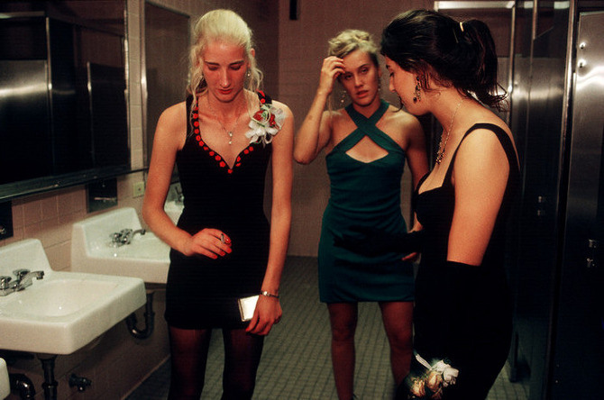
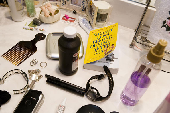
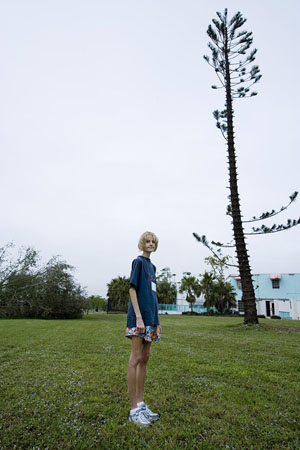
Renfrew 12-05  Renfrew 12-05 Fast Forward

Lauren Greenfield, Fast Forward: Growing Up in the Shadow of Hollywood, 1997, Girl Culture, 2002 and Thin, 2006

Acclaimed photographer and filmmaker Lauren Greenfield is considered a preeminent chronicler of youth culture, gender, fashion, media, wealth, beauty, and consumer culture as a result of her groundbreaking photographic projects (Girl Culture, Fast Forward, and THIN) and her documentary films (THIN, kids + money, Beauty CULTure, and The Queen of Versailles).

Her photographs have been widely published and exhibited, and are in many museum collections including the Art Institute of Chicago, Los Angeles County Museum of Art (LACMA), the J. Paul Getty Museum, the San Francisco Museum of Modern Art (SFMOMA), the Smithsonian National Museum of American History, the International Center of Photography, the Center for Creative Photography, the Museum of Fine Arts (Houston), the Harvard University Archive, the Smith College Museum of Art, the Clinton Library, and the French Ministry of Culture.

In 2012, she received one of the highest honors in documentary film, the Sundance Film Festival Directing Award, US Documentary 2012 for her documentary film, “The Queen of Versailles”. In 2003, American PHOTO Magazine named her one of the “The 25 Most Important Photographers Now.” In 2005, she shared the number three spot of the “100 Most Important People in Photography” (American Photo Magazine). She is the recipient of numerous photography awards and grants, including the ICP Infinity Award for Young Photographer (1996), the Art Directors Club Gold Cube for Photography (2011), a National Geographic Grant, a Hasselblad Foundation Grant, the People’s Choice Award at the Moscow Biennial, and the NPPA Community Awareness Award.

In 2009, Greenfield was one of eight photographers featured in the inaugural exhibit (L8S ANG3L3S) at The Annenberg Space for Photography in Los Angeles. In 2010, Greenfield’s work was also featured in a major historical exhibition at the Getty Museum entitled Engaged Observers: Documentary Photography since the Sixties (2010). Her THIN and Girl Culture traveling exhibitions, curated by Trudy Wilner Stack, have been seen by half a million people in over thirty venues around the world.

Greenfield’s first feature-length documentary film, THIN, aired on HBO, and is accompanied by a photography book of the same name (Chronicle Books, 2006). In this unflinching and incisive study, Greenfield embarks on an emotional journey through the Renfrew Center in Coconut Creek, Florida, a residential facility dedicated to the treatment of eating disorders. The feature-length documentary premiered at the Sundance Film Festival in 2006 and was nominated for an Emmy for Outstanding Direction in 2007. It won the Grierson Award for best documentary at the London Film Festival, and Grand Jury Prizes at the Independent Film Festival of Boston, the Newport International Film Festival, and the Jackson Hole Film Festival. The project was featured on The Today Show, Good Morning America, Nightline, and CNN and was excerpted in People Magazine. Greenfield’s followed-up documentary short film, entitled kids + money, was selected for the Sundance Film Festival 2008, won the Audience Award at the AFI Film Festival, the Hugo Gold Plaque at the Chicago International Television Awards, the Michael Moore Award for Best Documentary, the Cinema Eye Honor for Nonfiction Filmmaking, and broadcast on HBO in 2008. The film is a conversation with young people from diverse Los Angeles communities about the role of money in their lives. Her third documentary short, Beauty CULTure, was commissioned by The Annenberg Space for Photography in 2011, and became the central installation for a record-setting exhibition in Los Angeles (also entitled Beauty CULTure). Shot in Paris, New York and Los Angeles, this film is a critical examination of “…beauty in popular culture, the narrowing definition of beauty in contemporary society, and the influence of media messages on the female body image”. The short was selected to premiere in the Tribeca Film Festival’s Shorts Program in 2012.

In January 2012, Lauren Greenfield received the Sundance Film Festival’s Directing Award, US Documentary 2012 for her documentary feature film, The Queen of Versailles, which was released theatrically in 2012 (Magnolia Pictures), and will broadcast on Bravo in 2013. The film went on to become on of the top-grossing documentary films in 2012, received numerous awards, nominations, and “Best of 2012” accolades, including the Grand Jury Prize from the Brisbane International Film Festival (BIFFDOCS), a Best Director Award from the RiverRun Film Festival, a Special Jury Documentary Feature prize from the deadCenter Film Festival, and a prestigious nomination for Best Documentary Film, 2012 by the International Documentary Association (IDA). In 2013, Greenfield was one on only five directors nominated by the Directors Guild of America (DGA) for Outstanding Directorial Achievement in Documentaries for the year 2012. According to PBS/POV, The Queen of Versailles was ranked #2 of the Top 10 Documentaries of 2012, based on awards, nominations, peer recommendations, and other ranking criteria.

Greenfield graduated from Harvard in 1987 and started her career as an intern for the National Geographic Magazine. She lectures on her photography, youth culture, popular culture, and body image at museums and universities around the world.

http://www.laurengreenfield.com

Read Full Article

Art: Arnar Asgeirsson

unfair6,medium_large.1412172464

arnarasgeirsson-intersection-2014,medium_large.1405388751

Arnar Asgeirsson, Intersection #2, and Intersection, digital print, 50 x 65 cm, 2014

Arnar Ásgeirsson practice involves video works, animations, drawings, installations and sculptures with performative aspects deal with the queston of creative ownership, originality, the relation between high- and low art, reproduction and the differences between creating and copying.

Inserting objects as characters into new scenarios, creating the possibility of narratives to emerge. Believing that appropriated objects and re-produced items become works of art and shed light on their own history and their prior, current and future surroundings.

Read Full Article

Fall 2015, Ready-to-Wear: Christian Dior

020-dior

023-dior
024-dior

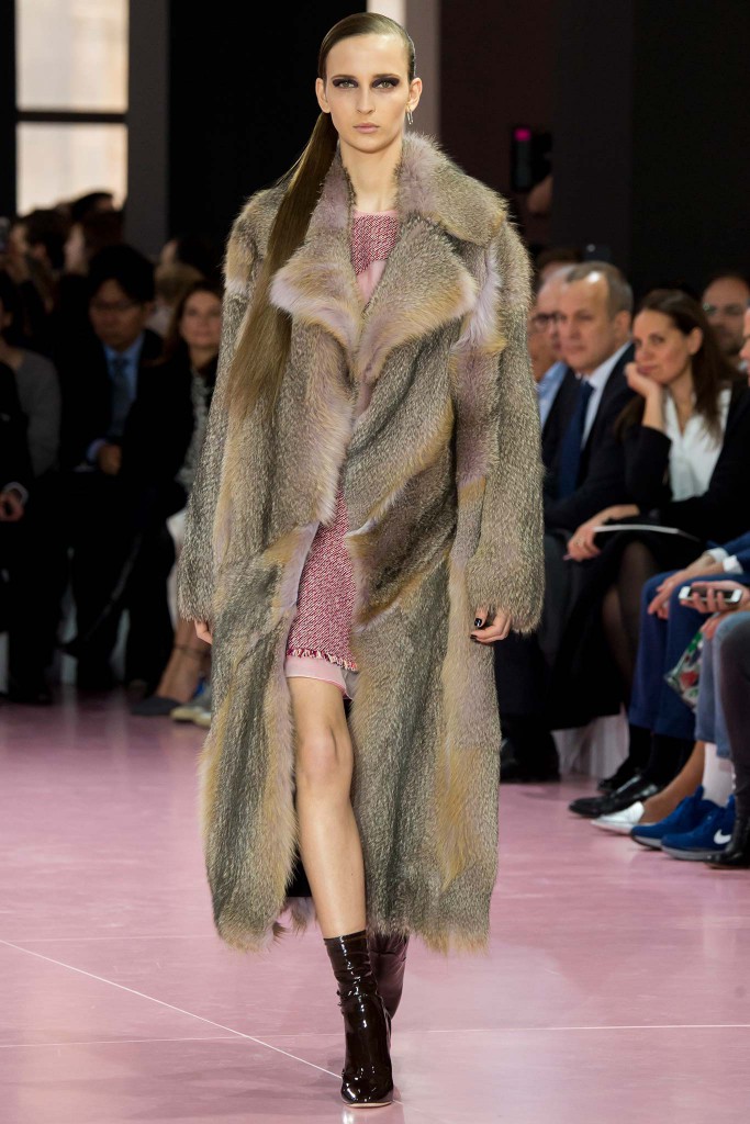
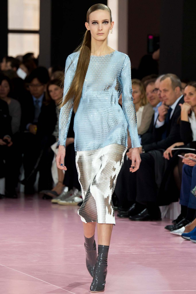
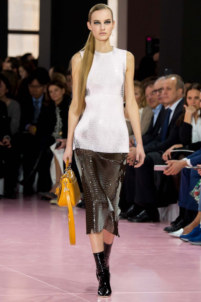
Christian Dior, Fall 2015, Ready-to-Wear, Paris, 2015

Throbbing Gristle’s “Hot on the Heels of Love,” the piece of music that soundtracked the Christian Dior show today, has a chilly, slaphappy Fifty Shades quality that seemed tailor-made for a collection whose animal essence was fulsomely described by Raf Simons as “something more liberated, darker, more sexual.” Something more than Dior’s femme fleur, in other words.

But it was also more commercial than anything Simons has offered before, in any of his guises. And saying that is no insult, because it underscores the confidence the designer has acquired in his time at Dior. He could backseat those curvaceous Bar-shaped classics in favor of man-tailored tweed pantsuits—double-breasted jackets and cropped, cuffed pants—and liquid mesh pieces that second-skinned the body. There was a nod to heritage in animal prints—Christian Dior introduced leopard print in 1947—but Simons’ homage was a blown-out reinterpretation that was so abstract as to look psychedelic…or maybe embryonic, emblematic of new life in the jacquard of a body stocking that Simons carried over from Couture.

That actually seemed like an apt metaphor for the whole collection. Simons talked about “a new kind of camouflage,” but what was it that was truly hidden here? Sex, of course. Sublimated under big, desirable tweed coats, in abbreviated coatdresses paired with thigh-high vinyl boots (go there!), in shifts collaged from fox with a tinge of unnatural nature. There was elegance and there was oddity in this collection—exactly what you’d expect from Raf Simons. But salability? Ah, yes, that was the news.

Read Full Article

Jil Sander, Fall 2015, Ready-to-Wear

MARC0073MARC0539

Jil Sander, Fall 2015, Ready-to-Wear, Milan, 2015

Frédéric Sanchez’s soundtrack—a blurry, impressionistic, almost atonal mesh of Nico’s and Chet Baker’s versions of “My Funny Valentine”—suggested chaos. But the set was a precisely ordered group of colored pillars, like a geometric Stonehenge. Rodolfo Paglialunga imagined his new collection for Jil Sander forming somewhere between the chaos and the precision. The designer would pluck order from disorder.

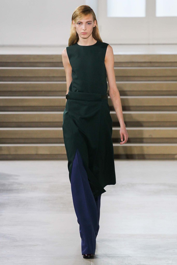
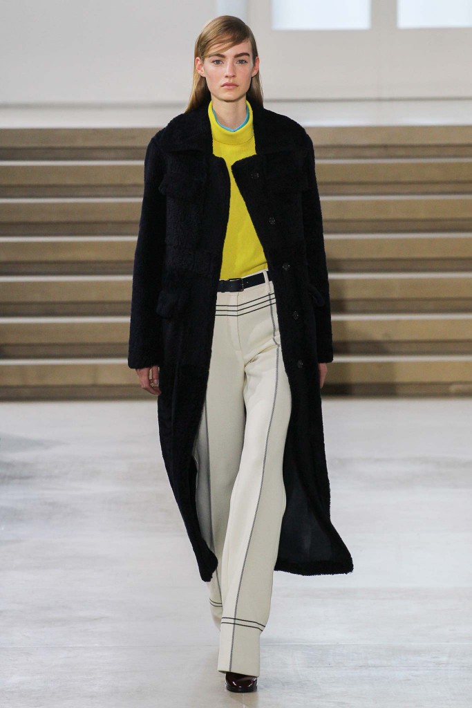
It’s all any artist tries to do, but Paglialunga’s challenge was a little more pointy, given the patchiness of his efforts to date. Still, he made huge strides with this collection. It won’t set Planet Fashion alight, but it registered as wearable, real-world, and properly proportioned. Credit the designer’s precision for that coup. Long coats and matching pants made a new kind of elegantly elongated suit. A bone-toned leather coat was a standout. The lines that traced a navy blue coat suggested something military, the most precise association of all. And even when Paglialunga started to mess with precision, he didn’t lose that line; it simply went diagonal. Shaved black mink was diagonally pieced for a coat. Dark green pony got the same treatment in a skirt.

Coatdresses were shadow-striped or crisscrossed with tape, always maximizing the line. You could follow the footwear for a subtext. One look featured correspondents paired with a pencil skirt and a full-sleeved knit top. Joan Crawford? That, at least, underscored Paglialunga’s disdain when he dismissed the ongoing debate about the dialogue between feminine and masculine in Jil Sander’s women’s collection as “banal.” If he could silence that debate, he’d definitely be able to put his own thumbprint on the label. So he showed a lovely, simple slipdress, and he closed the show with Hedvig Palm in a blush-toned coat that was forceful in line but indubitably womanly. Paglialunga is finding his feet.

http://www.style.com/fashion-shows/fall-2015-ready-to-wear/jil-sander

Read Full Article

Artist: Simon Denny

SimonDenny_13-b-600x899

SIDE156__1_-1400x933 SIDE160-1400x995

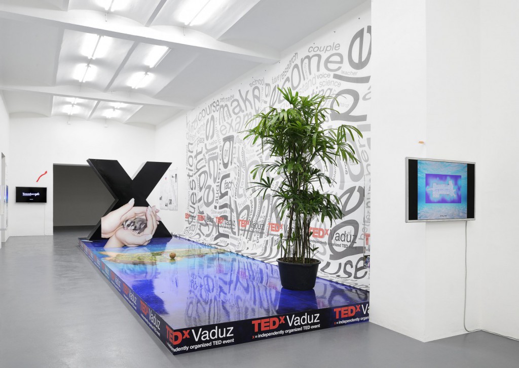
Simon Denny, New Management, 2014, Screen Crush Comparison 1, 2013 and TEDxVaduz redux, 2014, Installation Views

In a clipping from a 1914 edition of The New York Times, it is reported that dancer Paul Swan collapsed in the middle of the stage during his vaudeville debut. Almost a century later, on the evening that Simon Denny’s most recent exhibition opened at Friedrich Petzel Gallery, a perfectly aligned row of freestanding double canvases imitating flat-screen television sets crumbled like dominoes after a visitor inadvertently knocked them over. Like the seven paintings on duty that night, the performer billed by the press as “the most beautiful man” soon returned to the stage, put back on his feet by assistants, and finished his number to ecstatic acclaim.

Appropriately opening with a physical collapse in the gallery, Denny’s first solo exhibition in New York drew its material from two market crashes. “Corporate Video Decisions” is the title of similar exhibitions he presented at Michael Lett gallery in Auckland, New Zealand, and now at Friedrich Petzel in New York – but also that of a trade magazine from the late 1980s, circulated to corporations to help them boost consumer confidence using video after a market meltdown. In addition to a company website called Diligent Board Portals offering “paperless solutions” to corporate boardrooms, the defunct magazine provided images and text that Denny appropriated for works shown at Petzel – digital prints on canvas, videos, and found objects tracing an arc in time between the current recession and one that took place some 20 years ago.

In the video “Corporate Video Decisions Archive Interface Design” (2011), played onto a Samsung LN46C750 46-inch monitor at the entrance of the gallery, one recession is literally dragged and dropped into the other. Produced with the help of a corporate DVD designer, the video is based on Cover Flow, an animated, three-dimensional graphical user interface integrated within iTunes and other Apple Inc. products for visually flipping through content. Loaded with a digital archive of the magazine Corporate Video Decisions, Denny’s video endlessly cycles through issues of the publication as one would through a collection of mp3s. Like a rare album downloaded from an obscure blog, the colorful 1980s graphic design and zany creative photography of the cover pages were imported into a familiar interface – not just that of Cover Flow, but of Denny’s work, in which the creative subjectivity of the artist virtuosically hearkens back to the artist’s role as a consumer free from the needs of production.

When iTunes abstracts physical records into digital files, it merely reflects what Joseph Schumpeter called “creative destruction,” a moment in which a part of the economy falters to make room for growth and innovation elsewhere – Cover Flow is one such digital music venture that was born from the demise of physical records. Denny’s work often functions by latching onto such economic cycles of obsolescence to generate artworks.

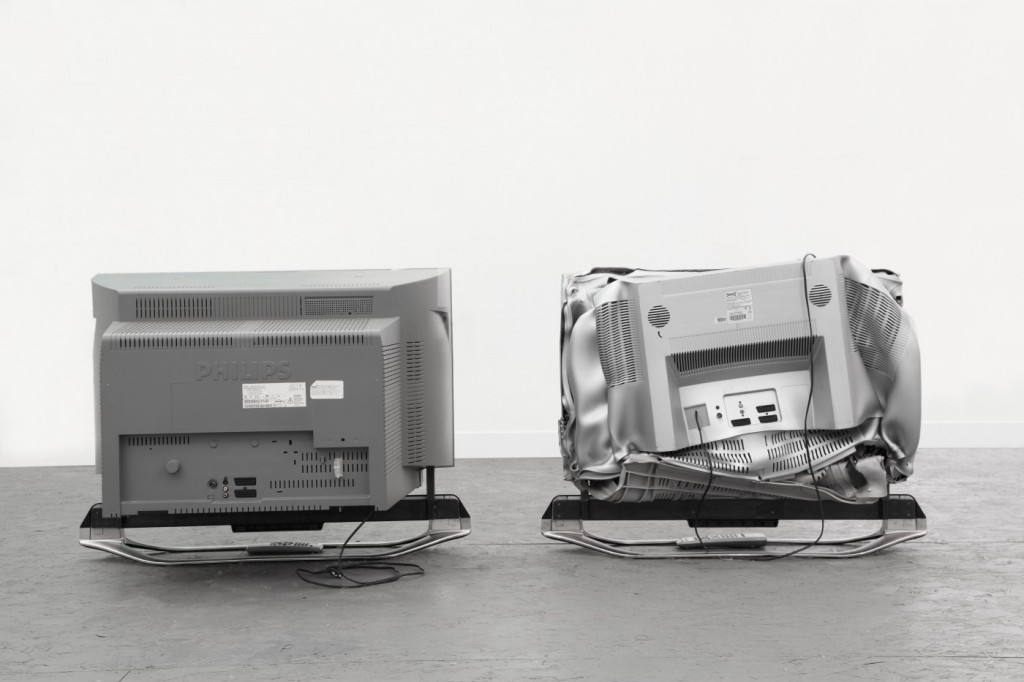
If those who lose their jobs during a recession usually have to settle for lesser pay elsewhere (that is, if they can find work at all), outdated objects like records, books, and electronics can greatly appreciate on niche markets kept afloat by collectors and hipsters. Something like this is happening when a television set thrown onto the curb or a defunct trade magazine becomes a painting or a sculpture in a gallery. For a residency, Denny once transformed photographic reproductions of an art center’s complete inventory of audiovisual equipment (including many outdated CRT monitors and VHS players) into relief paintings – a set of two canvases printed with the same photographic image of the television and superimposed using metal fittings adjusted to the real object’s thickness.

Produced using still images of the Samsung monitor hung in the same room, seven such canvases were shown freestanding on a drop cloth of transparent plastic at the center of Petzel’s exhibition space. Organized by the rigid architecture of Cover Flow, each canvas was an austere and cold, yet jazzy collage in which images of Corporate Video Decisions’s (the magazine) cover pages hovered above smaller images of their own content, which formed a tapestry in the background. Their display in a row formation was reminiscent of the production chain, or perhaps a waiting queue at the Social Security office – after all, aren’t these paintings literally just televisions that don’t work?

As the multiplying signs of social unrest amidst depressed economies and high unemployment may be demonstrating for the nth time at the moment, what we call “work” today is also, if not mainly, a means to keep bodies from doing something else. Typically at home in front of the TV or staring at the wall, the unemployed body is a sort of toxic asset whose destructive potential must be managed for the existing order to prevail. For “Decommissioned Trading Table/Workstation” (2011), a desk obtained from a recently bankrupt German corporation was disassembled piece by piece and hung on the wall to resemble a depressed financial graph. Here, Denny performs a prank he has been known for in the past: storing garbage in the smart fridge – or in other words, the gallery.

Mobilizing creativity to repackage and sell the sad relic – his “Decommissioned Trading Table/Workstation” functions as a sort of artistic Rettungspaket (rescue package) that ingenuously cures what the failing economy has transformed into junk by putting it back to work in the orgone accumulator of an art gallery.
After their collapse on opening night, the painting reliefs were back to a marching regiment formation in the center of the room, just in front of the disassembled trading table. If these hot canvases – hot in both the McLuhan-esque and “market” senses of the word – could catch on fire, they would burn like ice. Astutely directed by Denny, their invisible ballet exuded a sense of optimism. When screens and markets freeze, art still works.

Read Full Article

Galleries: David Zwirner, New York, London

CWNY_DZ_SHOW_2014_INSTALL_VIEW_12-600x450 CWNY_DZ_SHOW_2014_INSTALL_VIEW_8-600x450 CWNY_DZ_SHOW_2014_INSTALL_VIEW_11-600x450

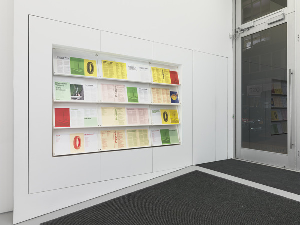
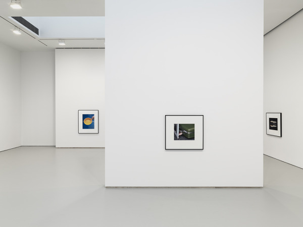
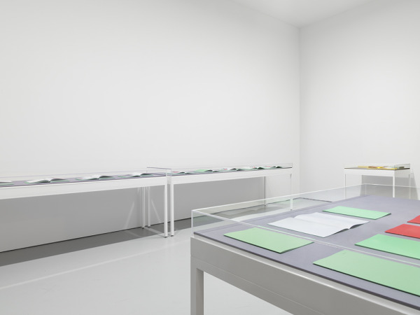
David Zwirner Gallery is a contemporary art gallery in New York City and London owned by David Zwirner that is active in both the primary and secondary markets.

The gallery opened in 1993 on the ground floor of 43 Greene Street in SoHo. In 2002, the gallery moved to 525 West 19th Street in Chelsea. In 2006, it expanded from 10,000 square feet (930 m2) to 30,000 square feet (2,800 m2), adding spaces at 519 and 533 West 19th Street. This allows the gallery to mount three independent, full-scale exhibitions simultaneously. From 2000 to 2009, Zwirner was a partner with Iwan Wirth in Zwirner & Wirth.

In March 2012, the gallery announced its expansion to Europe (in London’s Mayfair neighborhood). It opened in October 2012 with a solo exhibition of new works by Luc Tuymans.

In February 2013, the gallery also opened an additional 30,000-square-foot (2,800 m2) space in New York’s Chelsea neighborhood. The five-story building was designed by architect Annabelle Selldorf and will become the first commercial art gallery to receive LEED (Leadership in Energy and Environmental Design) certification.

David Zwirner (born October 23, 1964) is an American art dealer and owner of the David Zwirner Gallery in New York City and London (which opened in October 2012 with an exhibition by Luc Tuymans). In 2013, Zwirner was listed at number two in the ArtReview annual “Power 100” list and in 2012, he was listed at number two in Forbes magazine’s “America’s Most Powerful Art Dealers.” 

http://www.davidzwirner.com

Read Full Article

Lauren Greenfield, The Queen of Versailles

article00Versailles_house

Lauren Greenfield, The Queen of Versailles, 2012, digital video, 100 minutes and the Versailles Property, 2014

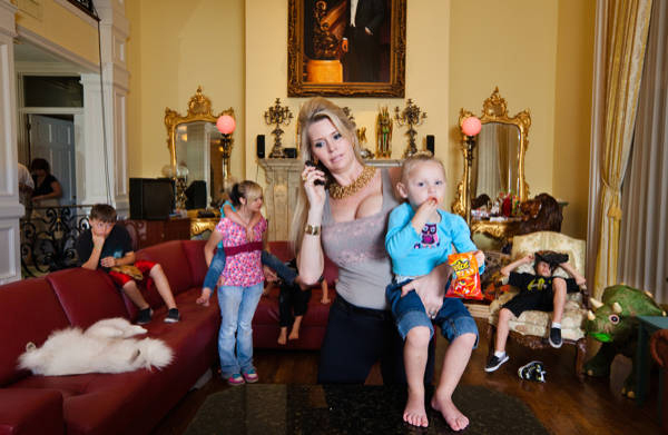
The Queen of Versailles is a character-driven documentary about a billionaire family and their financial challenges in the wake of the economic crisis. With epic proportions of Shakespearean tragedy, the film follows two unique characters, whose rags-to-riches success stories reveal the innate virtues and flaws of the American Dream. The film begins with the family triumphantly constructing the largest privately-owned house in America, a 90,000 sq. ft. palace. Over the next two years, their sprawling empire, fueled by the real estate bubble and cheap money, falters due to the economic crisis. Major changes in lifestyle and character ensue within the cross-cultural household of family members and domestic staff.

David Siegel is the wealthy owner of Westgate Resorts, a timeshare company in Florida. His wife Jackie Siegel, thirty years his junior, is a former Miss Florida contestant with a computer science degree. They begin construction on the Versailles house, a mansion modeled on the Palace of Versailles. Located on the outskirts of Orlando, it would be the largest single-family detached home in the United States if completed.

However, Siegel’s company is badly affected by the Great Recession in 2008 and his family struggle to cope with their reduced income. Construction on the new house is halted, most of their servants are laid off and their pets are neglected. David retreats into his office, determined to save his property venture in Las Vegas. Jackie struggles to rein in her compulsive shopping habits. The children and their nanny are also interviewed. The film ends with none of their issues resolved.

The New York Times’ A. O. Scott called the film “A gaudy guilty pleasure that is also a piece of trenchant social criticism,” and said, “the movie starts out in the mode of reality television, resembling the pilot for a new “Real Housewives” franchise or a reboot of “Lifestyles of the Rich and Famous.” Before long, though, it takes on the coloration of a Theodore Dreiser novel — not quite an American tragedy but a sprawling, richly detailed study of ambition, desire and the wild swings of fortune that are included in the price of the capitalist ticket.”

The Economist called it “an uncomfortably intimate glimpse of a couple’s struggle with a harsh new reality,” concluding that “the film’s great achievement is that it invites both compassion and Schadenfreude. What could have been merely a silly send-up manages to be a meditation on marriage and a metaphor for the fragility of fortunes, big and small.”

The documentary won the U.S. Directing Award at the 2012 Sundance Film Festival, the Grand Jury Prize from the Brisbane International Film Festival, and a Best Director Award from the RiverRun Film Festival. The Queen of Versailles was also nominated for Best Documentary Film, 2012, by the International Documentary Association (IDA).

Lauren Greenfield graduated from Harvard in 1987 and started her career as an intern for the National Geographic Magazine. She lectures on her photography, youth culture, popular culture, and body image at museums and universities around the world.

http://www.imdb.com/title/tt2125666/

Read Full Article

Wojciech Kosma, “In the beginning was the word,” Rehearsal II

177107654_1280x720fed5aa12525514ac233044e0748c396731dc7f67

Wojciech Kosma, In the beginning was the word, Rehearsal II, 2011 and The—family Part 1: Pieta, 2013

It’s not often that we get to spy on each other’s private relationships. Reading a Facebook wall is no substitute for watching a couple alone in bed. Is it even possible for intimacy to be glimpsed from the outside – or does it become something else just by virtue of being watched? If we could witness the inner workings of others’ relationships, how would it change the way we think about our own? Over the past two years, the artist Wojciech Kosma has established a framework for performance art that maximizes the act of self-exposure, asking whether it is precisely through the act of public performance that the most ‘authentic’ relationships can develop.

Kosma is a Polish artist based in Berlin. His artistic history is varied – he has a background in computer science and music composition – but since around 2011, he’s become devoted to an increasingly unified pursuit, dubbed The—family, in which he creates performances using live actors. To the naked eye, each performance looks like a pair of close friends or lovers have landed in a room without instructions and been left to their own devices. Kosma’s influence is remote, his role distilled to the creator of conditions within which action can develop – a kind of John Cassavetes without a camera.

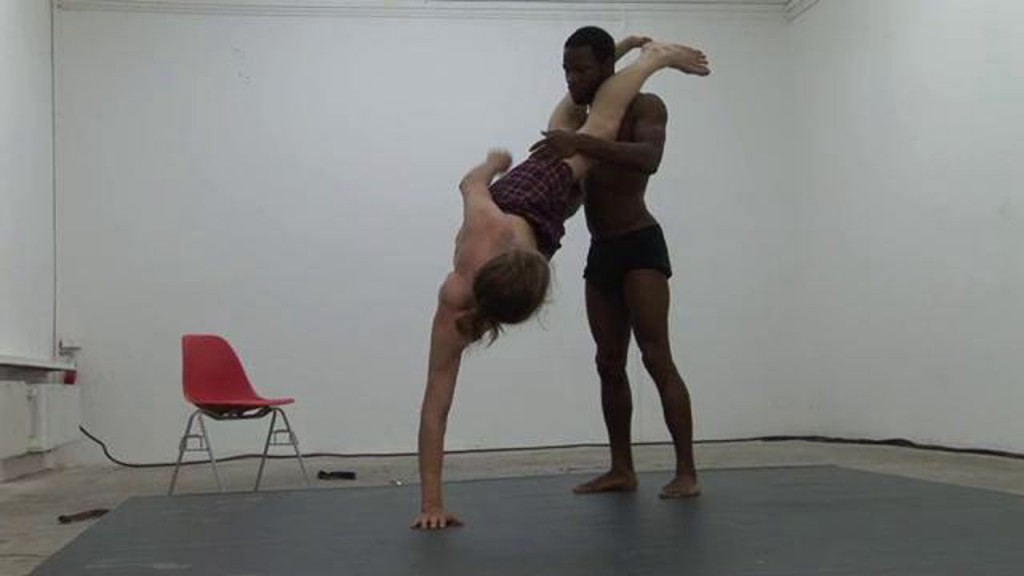
The most recent iteration of The—family series of performances, Pieta, occurred in January 2013 at LEAP overlooking Alexanderplatz in Berlin. For two consecutive nights, viewers were given a window into the relationship between Brian Doose, a 24-year-old American and Ingrid Sattes, a 51-year-old German. Sattes and Doose circled each other on a mat in the middle of the room: joking, fighting, fondling, singing, arguing and kissing.

Seemingly without self-censorship, Sattes gave a tearful account of a recent meeting with her ex-Nazi father, confessed age anxiety and body issues and sought reassurance and comfort from her partner – who at varying moments either gave or withheld affection. As power dynamics emerge between various actors in Kosma’s pieces, they become archetypes for relationship typologies we’ve all experienced in some form or another. Perhaps one falls into preconditioned patterns when on stage. Or perhaps we are all performing received notions of intimacy even when alone together.

Kosma orchestrates The—family relationships within a prescribed space. The people he selects rehearse regularly and rigorously in a defined area where he is always present but which is generally open to visitors. During this process the performers’ relationships begin to leak out into non-performance time; they meet the rest of the group and go out together – re-situating their relationships into the ‘regular’ arena of social performance. The difference is that those of us who have seen them perform have seen them at their most vulnerable moments – we know them, obliquely, in the way we are only used to knowing a best friend or a lover.

Far beyond the range of ‘performance as performance’, Kosma’s work elucidates the permeable membranes of artistic production and social space. Over time he is establishing a form of community between both realms. The—family is not a direct product of the art world but an outlet from its sphere within the scope of its influence.

http://frieze-magazin.de/archiv/kritik/wojciech-kosma/?lang=en

Read Full Article

Artist: Pennacchio Argentato

Pennacchio_Argentato_-_You_Will_Never_be_Safe_2013-800x533tumblr_lu6xtl8MX81qisuruo1_1280

Pennacchio Argentato, Survival Upgrade, 2013 and Dude where is my career?,  2009

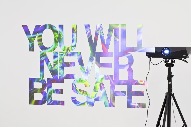
In May 2013, footage emerged in the media of a man waving a bloodied meat cleaver in the air whilst reciting the mantra to the camera: ‘You [people] will never be safe’. The phrase formed part of a political message delivered in the style of a home video to the British public by the man who, along with one other, had hacked a British soldier to death on the streets of Woolwich just moments before. The footage was threatening, macabre and darkly arresting; its rapid dissemination on the Internet pointed to a grim, voyeuristic fascination with the brutal crime and its motivations.

It is this interaction of human events with the complex machinations of technology that appears to fascinate collaborators Pasquale Pennacchio and Marisa Argentato. The two artists wrenched the phrase ‘you will never be safe’ from this context as part of their exhibition ‘Survival Upgrade’ and hung it in the centre of Van Horbourg, a non-profit curator’s collective operating within a temporary art space in Zurich run by founders and co-directors Sandra Oehy and Roger Meier. Far from the original setting of the crime, the sinister words were objectified by the artists, who frequently use the technologies of fabrication and projection to attempt to engage with the hypnotic and transformative powers of technology.

Pennacchio Argentato cut the words out of Perspex with a light-transmitting film on one face. Behind this, a projector was set up at a distance to transmit swirling fractal images through the Perspex and onto the front surface of the text. The overall effect was that of gaudy kitsch, visually arresting when you first enter the space and face the text, but less convincing as you move around and to the rear of it. This was largely due to the material itself, which is flat and flimsy, slightly undermining its own apparent status as the centrepiece of the exhibition. The flatness of the material did however have one curiously confounding effect, which was to negate the very depth of the images projected onto it. By turning the freestanding words into a screen upon which the abstract receding fractals were projected, the artists managed to debunk any conventional optical illusion of depth commonly associated with filmic projection, or indeed with any projection onto the solid wall of a gallery, because in this case the audience could walk behind the ‘screen’. The projection, in other words, was revealed for the ruse it really is, while at the same time the words lost their meaning in deference to the hypnotic optical effects they have become a latent surface for.

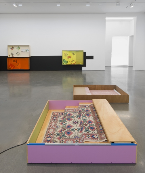
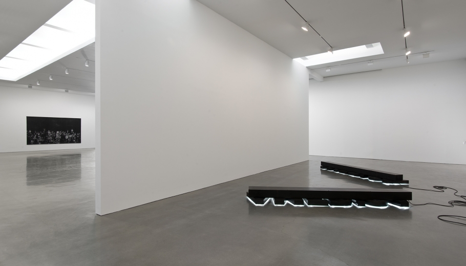
In past exhibitions, notably ‘Five o’clock shadows’ at T293 Gallery, Rome in 2010 and the group show ‘Where Language Stops’ at Wilkinson Gallery in London in 2011, Pennacchio Argentato have exhibited immense planar forms cast from concrete, wood and fibreglass that slide, fold, slither or droop lazily across the floors and walls of galleries. But in the second part of ‘Survival Upgrade’, the artists’ almost comically anthropomorphic sculptures were reinterpreted as prosthetic human limbs cast out of Carbon-Kevlar, a material favoured by the US army for the manufacture of soldiers’ combat helmets and other protective gear. This is a new material for the artists, who have previously worked with cast concrete and Perspex, yet the experiment seems successful. The Carbon-Kevlar appears both sleekly organic and awkwardly mechanistic, able to mould itself symbiotically with the human body whilst retaining the appearance of a hard, shiny shell, cast off like the plasticized robotic detritus of some future world in which the technological extension of the body has already outlived its usefulness. These apparatuses occupied the periphery of the space in which the text formed the centrepiece, yet they were by no means secondary to it. Flung to the edges of the white room by some centrifugal force, either adhering to the walls or scattered about the floor for the viewer to pick his or her path between, the prosthetic limbs were rendered as junk, as the bodies they were made for have evolved – or mutated.

http://www.frieze.com/shows/review/pennacchio-argentato/

Read Full Article