Magazine Contemporary Culture

Art

Art: Ed Atkins, A Tumour (In English), 2010

Ed Atkins

Ed Atkins, A Tumour (in English), video still, 2010

London-based artist Ed Atkins interest in high definition makes him a rarity in a landscape of video artists who work with antiquated 35mm and 16mm. Digital film is innately mysterious – it’s data in a box – but Atkins turns it into stuff you feel under your skin and in your gut. His work has a violent poetry, not least in the texts that accompany the films. His Death Mask series includes a Madame Tussaud film script ripe with gruesome details about the famed wax-sculptor’s trade in guillotined corpses. The body, illness and death are all major themes.

A Tumour (In English), is a case in point. Electronic blurs and booms, crazy drum rolls and bass thrums complement footage and special effects that conjure domes, moons, black spots and a wet red wrinkled orb that might be a cancerous blood cell. An animated digital mouth asks in a drugged, ominous voice: “Would you mind checking the mole on my shoulder? … Will you take a look, son?” before describing the “lonely juices bubbling beneath the crust”, “bone marrow, browned in the air”, and other haikus of bodily horror. In an accompanying book, the detail is relentless. It even promises to “conjure a tumour inside you”. Who says art can’t have a real-world impact?

Cadavers play a complicated role in Atkins’s work. Decaying bodies – smelly, soiled and solid; not to mention loaded with memories of those they leave behind – could not be further from the weightless digital realm. Yet he makes a ferocious attempt at closing the gap, pushing video and audio to visceral new extremes.

Read Full Article

Nina Beier “HEAVY HAND” 2013

Nina BeierNina Beier

Nina Beier

Real Estate, view setup , 2013, Loulou , 2013 and Smokes , 2013

“Growing up in Los Angeles, I have spent a majority of my life in traffic, looking out the window watching disgruntled individuals make their way from point A to point B, then C, into eternity.  You find yourself staring at your reflection in the waxed surfaces of the cars next to you looking for some sense of purpose in the homogenized population of vehicles of the freeways (and in many ways not so free at all). As you continue your journey moving forward, you lean back, and rest your head.”  Statement written for “Heavy Hand” and exhibition by Nina Beier at Standard, in Oslo, Norway.

Of any artist working today, 35-year-old hyper-mixed-media artist Nina Beier is creating some of the boldest examples of the contemporary artwork in crisis mode. This has a lot to do with the unstable, in flux, usually-referencing-something-absent, often-crushed-or-pieced-together, and likely-to-change nature of her sculptural explorations.

The Danish-born Beier gets much of her creative impulses from philosophy and literature (Heidegger and Lewis Carroll are recent touchstones). But for all of the theoretical uplift, the end result is provocatively tactile. Her most recent productions include dipping photographic stock images in glue and hanging them to dry on mass-produced household items, thus using an image to utterly envelop an actual thing. Another series involves found secondhand fabrics stuffed together inside a frame to create an almost Arte Povera-esque surface on the verge of busting open.

Beier has been living in Berlin for the past three years after starting her career in London. “I moved mainly because I was attracted to the qualities of an underpopulated city,” she says. “I guess the pace of the city is a little slower than other cities I have lived in, but I find the contrary to be true when it comes to the productivity of artists who live here.”

Read Full Article

Michael Schmidt, Lebensmittel (Food)

Michael Schmidt, From the series,  Lebensmittel, 2006 – 2010

Michael Schmidt is one of Germany’s most important social-documentary photographers. Although he works in series, each photograph stands as an autonomous work in its own right. When the photographs are seen together in a book or an exhibition, connections between two pictures give rise to a third, as Schmidt explained in an interview with Dietmar Elger in his book Irgendwo.

In his Lebensmittel series (2006–10), Schmidt confronts photography with its painterly qualities in 177 photographs. The work’s all-too-perfect patterning makes it look like a naturalistic painting and manifests an immaculate production process. While using the documentary form of investigative journalism, Schmidt succeeds in capturing the social reality, hybridity and poverty of the food industry in a way that is neither accusatory nor dismissive. Schmidt is not concerned with finding a clear, self-sufficient aesthetic form. He opts neither for pure confrontation with the monstrosity of reality, nor for escapist visions based on abstraction. Instead, in his work, the aestheticized landscape becomes a mere region, a building is just architecture, a still life is simply an arrangement of objects.

Schmidt was born in east Berlin, but his family crossed to the west before the construction of the Berlin Wall in 1961. He trained as a policeman, at his parents’ insistence, before taking up the camera in 1965 to document the streets, buildings and people of west Berlin. He later told an interviewer: “I could also make photos somewhere else; I just wouldn’t know why.” Schmidt was self-taught, and his early series, including Stadtlandschaft (Urban Landscapes) (1974-75) and Berlin, Stadtbilder (Berlin, Urban Images) (1976-80) mapped out the city in which he lived in a semi-documentary way. In 1976, he founded the Werkstatt für Fotografie (Workshop for Photography) in Berlin, and invited several leading American photographers, including William Eggleston and John Gossage, to teach there.

In the following decades, his approach became more impressionistic. He would shoot thousands of frames for each project without thinking too much about the end result, which would emerge later out of rigorous editing. Increasingly, he was drawn to series over single images, atmosphere over documentary representation.

http://www.theguardian.com/artanddesign/2014/may/28/michael-schmidt

Read Full Article

Jeff Koones: Metallic Venus

Jeff Koones Metallic Venus

Jeff Koones, Metallic Venus, 2010-2012. Mirror-polished stainless steel with transparent color coating and live flowering plants

Jeff Koons is reaching back into art history with his new series “Antiquity,” exploring the goddess of love in huge glossy metallic sculptures such as the turquoise Metallic Venus.

Jeff Koons: The Painter and Sculptor was showing at two venues in Germany’s banking capital (20 June-23September 2012).  Sculptures towering over ancient figures in Frankfurt’s Liebieghaus museum, where Koons’s work was interspersed among sculptures from antiquity to the 19th century.

Jeff Koons plays with ideas of taste, pleasure, celebrity, and commerce. “I believe in advertisement and media completely,” he says. “My art and my personal life are based in it.” Working with seductive commercial materials (such as the high chromium stainless steel of his “Balloon Dog” sculptures or his vinyl “Inflatables”), shifts of scale, and an elaborate studio system involving many technicians, Koons turns banal objects into high art icons. His paintings and sculptures borrow widely from art-historical techniques and styles; although often seen as ironic or tongue-in-cheek, Koons insists his practice is earnest and optimistic. “I’ve always loved Surrealism and Dada and Pop, so I just follow my interests and focus on them,” he says. “When you do that, things become very metaphysical.” The “Banality” series that brought him fame in the 1980s included pseudo-Baroque sculptures of subjects like Michael Jackson with his pet ape, while his monumental topiaries, like the floral Puppy (1992), reference 17th-century French garden design.

https://www.artsy.net/artist/jeff-koons

Read Full Article

Lutz Becker, Cinema Notes, 1975

Lutz Becker, Marina Abramovic, Cinema Notes, 1975Lutz Becker, Marina Abramovic, Cinema Notes, 1975

Lutz Becker, Installation view, Cinema Notes, 1975. 16mm Black and White, 45 mins

For many years lost and recently found, Kino Beleške was produced in 1975 in collaboration with the group of artists, curators and critics gathered around the Student Cultural Centre, Belgrade. The film includes verbal statements and performative gestures of the numerous protagonists of the New artistic practice in former Yugoslavia, referring to the role of art in society and re-thinking the concepts of form, autonomy, economy, politicality and institutionalization of contemporary art.

Participants were Marina Abramovic, Dunja Blazevic, Jesa Denegri, Goran Djordevic, Nesa Paripovic, , Bojana Pejic, Zoran Popovic, Jasna Tijardovic, Slavko Timotijevic, Rasa Todosijevic, Biljana Tomic, Goran Trbuljak, Dragomir Zupanc

Read Full Article

Online Resource: http://www.ubu.com/

Bruce Nauman, Good Boy Bad Boy,1985 and Video Against AIDS, Curated by John Greyson and Bill Horrigan, produced by Kate Horsefield, 1989

UbuWeb is an independent online resource educational resource for avant-garde material. UbuWeb does not distribute commercially viable works but rather resurrects avant-garde sound art, video and textual works through their translation into a digital art web environment, re-contextualising them with current academic commentary and contemporary practice

All materials on UbuWeb are being made available for noncommercial and educational use and the service is completely free.

http://www.ubu.com/

Read Full Article

Painting: Mathew Cerletty

Mathew Cerletty The Economist, 2007 oil on linen 106,5 x 213 cm

Mathew Cerletty Yoplait, 2007 colored pencil and gouache on paper 35,56 x 33,65 cm
Mathew Cerletty Epson, 2009 graphite on paper 76,2 x 76,2 x 2,54 cm

Mathew Cerletty, The Economist, 2007, oil on linen, Yoplait, 2007, colored pencil and gouache on paper and Epson, 2009 graphite on paper

Since the early 2000s, Mathew Cerletty has been earnestly stretching the possibilities of figurative painting while cleverly subverting much of what we have come to expect from both realism and hyperrealism. Transitioning from his early, psychologically compelling portraits to more abstracted takes on household products and text-based images, Cerletty has been probing some amazingly banal subject matter as a challenge to the transcendent promise of traditional painting and to his skills as a draftsman.

Mathew Cerletty was born on 1980 in Milwaukee, Wisconsin New York. Matthew Cerletty’s paintings encapsulate a cosmopolitan air with their voguish finish and ambivalent sexuality. Presenting a fragmented body, Cerletty’s untitled trade’s image for the fetish of gesture, his absent figure reduced to an intimation of style. Rendered as graphic form against an empty slate colored ground, Cerletty’s hands seem strangely foreign and empirical. Classically positioned, Cerletty sets his study as abstracted intrigue, his opaque white sleeve and purple nail polish convert the representational to formalist balance, constructing the sublime through the simplicity of casual expression.

Matthew Cerletty’s Untitled reconsiders the figure as an abstracted strategy of design. Set on a cold ground, his torso is centered as an obsessional focus of concentration. Rendered with painterly impasto, his shirt becomes a slacker study of illusionary space: its simplified cartoon form balancing between graphic flatness and 3D perspective, the stylised shadow alluding to sculptural form reinforces the planar surface. The addition of the hands converts Cerletty’s painting from compositional study to relational subject, infusing traditional line, shape, and tone with dandyish and charismatic personality.

Read Full Article

Artist: Dough Aitken

doug-aitken-now-2

002_aitken-doug_theredlist Doug Aitken

Dough Aitken, Now, 2010, Now, 2009 and Fountain (Earth Fountain), 2012

Central to Doug Aitken’s “100 YRS” exhibition is a new “Sonic Fountain,” in which water drips from 5 rods suspended from the ceiling, falling into a concrete crater dug out of the gallery floor. The flow of water itself is controlled so as to create specific rhythmic patterns that will morph, collapse and overlap in shifting combinations of speed and volume, lending the physical phenomenon the variable symphonic structure of song. The water itself appears milky white, as if imbued and chemically altered by its aural properties, a basic substance turned supernatural. The amplified sound of droplets conjures the arrhythmia of breathing, and along with the pool’s primordial glow, the fountain creates its own sonic system of tracking time.

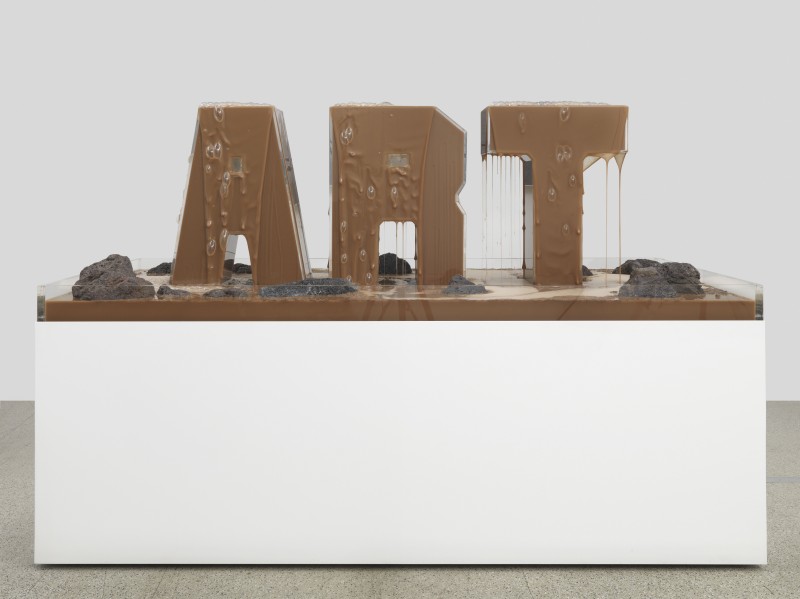
Behind a cavernous opening carved into the gallery’s west wall is “Sunset (black),” a sculptural work that resembles cast lava rock in texture and spells out the word SUNSET as it glows from behind, its letters forming a relic of the entropy and displacement inherent in the literal idea of a sunset. Viewed from and obscured behind a hole in the wall, the sculpture appears as cosmic debris, as if pulled from a parallel world where a sunset is only an idea, obfuscated by detritus of the age of post-everything, a reductionist standpoint between the modes of pop and minimalism, its glow fading into the next realm. Also on view is the mirrored sculpture “MORE (shattered pour)”. Like a time-piece, the work creates a kaleidoscope of reflections of all that surrounds it. As if it were a fragmented film, “MORE (shattered pour)” creates a literal manifestation of the present and aspirational escapism, which cannot be viewed without glimpsing a piece of one’s self within the work’s reflections. Another refraction of time is glimpsed through “Fountain (Earth Fountain)”, created from plexiglas letters spelling the word “ART”, through which a slurry of moist dirt is pumped, physical earth perpetually redoubling and standing in for itself. The word ART itself subverts the entropy of time, creating a holding pattern that organic matter cannot escape from. The flickering lightbox “not enough time in the day” completes the communicative supercurrent of shimmering malaise, its letters overlapping as if seen inebriated, somehow both more profound and less understandable. The work creates a cycle that is both hypnotic and inescapable.

Doug Aitken lives and works in Los Angeles and and New York. In March 2013, the Seattle Art Museum will install “Mirror,” a monumental new commission made of LED’s, permanently installed on the museum’s facade, while the Miami Art Museum will reopen its new building with the outdoor large scale projection of “sleepwalkers (miami).” In addition, SFMOMA in San Francisco is making plans for a large-scale citywide installation of Aitken’s Empire Trilogy in site-specific locations. Aitken’s work has been featured in numerous solo and group exhibitions around the world, in such institutions as the Serpentine Gallery in London, the Vienna Secession, and the Centre Georges Pompidou in Paris. He participated in the Whitney Biennial 1997 and 2000 and earned the International Prize at the Venice Biennale in 1999. Aitken’s “Sleepwalkers” exhibition at MoMA in 2007 transformed an entire block of Manhattan into a cinematic experience as he covered the museum’s exterior walls with projections. In 2009, his Sonic Pavilion opened to the public in the forested hills of Brazil at INHOTIM. Continuing his work in innovative outdoor projects, Aitken presented his film and architecture installation “Frontier” on Rome’s Isola Tiberina in 2009, the multiform artwork “Black Mirror” on a uniquely designed barge floating off Athens and Hydra Island in 2011, and “Song 1″ projected onto the circular facade of the Hirshhorn Museum in Washington, DC in 2012.

http://www.dougaitkenworkshop.com/selected-work/

Read Full Article

Saâdane Afif

2007-01-saadane-afif-1 2007-01-saadane-afif

Saâdane Afif, Blue Time vs. Suspense, 2007

Saâdane Afif plays with notions of displacement, collusion and contrast. He uses objects, scale models and installations, sounds and writing to mirror in the work of art itself the dialogue arising between the artist and the viewer. This dialogue makes allusions to psychological, historical, social and cultural elements.

Thanks to this extended formal vocabulary, borrowed as easily from the history of art as from the world of the media and music, Afif creates installations made up of unexpected encounters between objects and disciplines. Power Chords, produced for the Lyon Biennial in 2004, and for which he won the International Prize for Contemporary Art from the Fondation Prince Pierre in Monaco, is a sound installation for eleven electric guitars controlled by informatics. Each guitar emits its own note at random, in order to compose “key” harmonies from Rock history that are the musical transcription of mathematical harmonies played by artist André Cadéré with the drumsticks.

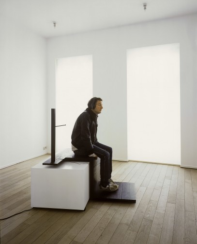
Blue Time vs. Suspense is especially produced for the Xavier Hufkens Gallery. It makes a synthesis between two older projects: Blue Time and Suspense. Blue Time vs. Suspense comprises three guitars/black clocks hung like suspension points, attached to three amplifiers via audio cables. The sound produced is similar to that of three out-of-tempo metronomes.

“To produce a musical instrument related to time, is to recall that the mastering of the latter lies at the heart of an artist’s preoccupations”.

The lyrics of the two songs about the older pieces, from which this new work originates, are stuck on the walls in adhesive letters. They accompany a text created for the occasion referring to the new work. Playing alone, the musician Vale Poher performs these texts, accompanying the songs on electric guitar. This is broadcast via headphones placed on a stand upon which the visitor can sit.
The style of music and the instrument perfectly match the project.

A screen-printed poster features the titles of the album and by extension, the titles of the works. It is a kind of exhibition ‘credits’.

A CD, also produced for the occasion, is a recording of the exhibition in words and music.

Read Full Article

Renee So

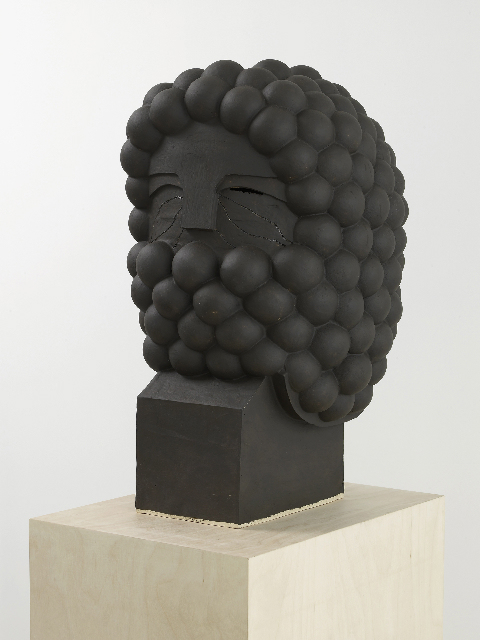
renee soBellarmine X, 2012 ~ glazed ceramic, birch plywood, 47 x 50 x 50 cm

Renee So, Bellarmine IX, Bellarmine X and Untitled, 2012

With their penchant for drunken acrobatics and big jolly beards, the characters Renee So brings to life are a lovely gang of odd bods. In the giant “knitted portraits” she creates on a 1970s pre-computerised machine, her figures – who wear ballooning Elizabethan trousers and top hats and carry canes or clay pipes – seem to have been rummaging in history’s dressing-up box. Meanwhile, their flat, 2D forms and rigid poses resemble ancient tapestries, friezes and cartoons all at once.

They have coloured beards that cover their mouths like bubble bath foam. Their eyes are mysterious – are they laughing or glaring? So’s ceramic busts are similarly intriguing. Their hair is made from Malteser-like brown orbs, and their masks resemble Roman helmets. Some have double heads, like kings in a pack of cards; some wear hats. They’re comic and stoic, taking our smiles with dignity.

Born in Hong Kong and raised in Australia, So’s earlier work addressed her dual heritage. A self-confessed “craft nut”, she turned to knitting to create images that referenced tourist export chinoiserie and its trade routes. Since moving to London in 2005, she’s looked at the history of European sculpture, both grand and humble. While her masked ceramics suggest armoured soldiers and curly-haired Caesars, she also uses pottery to portray a more knavish people’s hero: Bartmann.

She discovered Bartmann, or Bellarmine, stoneware in the V&A and was immediately hooked by its convoluted history. First brought to Britain from Germany in the 1500s, Bellarmine beer jugs double up as depictions of bulbous bearded men, descendants of the Wildman of medieval folklore. Their name is a jibe at an unpopular cardinal who condemned drinking. They were a sure-fire hit, and their fame mushroomed.

So sets this figure free from his roots as a mass-produced beer mug. In her sculptures and knitted portraits, we glimpse surreal transhistorical tales where dandies, drinkers, kings and soldiers are one and the same. Inviting us to imagine the backstory, these inscrutable bearded and masked players show that identity is a shifty business, built on tangled traditions and stereotypes.

Read Full Article

Prada Marfa

Marfa-35mm-029

Elmgreen and Dragset, Prada Marfa, 2005

Prada Marfa is a permanently installed sculpture by artists Elmgreen and Dragset, situated 2,3 km northwest of Valentine, Texas, just off U.S. Route 90, and about 60 km northwest of the city of Marfa. The installation was inaugurated on October 1, 2005. The artists called the work a pop architectural land art project. The sculpture, realized with the assistance of American architects Ronald Rael and Virginia San Fratello, cost US$80,000 and was intended to never be repaired, so it might slowly degrade back into the natural landscape.

Designed to resemble a Prada store, the building is made of adobe bricks, plaster, paint, glass pane, aluminum frame, MDF, and carpet. The installation’s door is nonfunctional. On the front of the structure there are two large windows displaying actual Prada wares, shoes and handbags, picked out and provided by Miuccia Prada herself from the fall/winter 2005 collection. Prada allowed Elmgreen and Dragset to use the Prada trademark for this work. Prada had already collaborated with Elmgreen and Dragset in 2001 when the artists attached signage to the Tanya Bonakdar Gallery in New York City with the false message “Opening soon – PRADA”.

Read Full Article

Cindy Sherman: Retrospective

cindy sherman

Cindy Sherman: “Untitled #465”, 2008, C-Print, 161,9 x 145,4 cm

Cindy Sherman, Retrospective, February 26-June 11, 2012
The Museum of Modern Art, New York

Throughout her career, she has presented a sustained, eloquent, and provocative exploration of the construction of contemporary identity and the nature of representation, drawn from the unlimited supply of images from movies, TV, magazines, the Internet, and art history.

Working as her own model for more than 30 years, Sherman has captured herself in a range of guises and personas which are at turns amusing and disturbing, distasteful and affecting.

To create her photographs, she assumes multiple roles of photographer, model, makeup artist, hairdresser, stylist, and wardrobe mistress. With an arsenal of wigs, costumes, makeup, prosthetics, and props, Sherman has deftly altered her physique and surroundings to create a myriad of intriguing tableaus and characters, from screen siren to clown to aging socialite.

http://www.moma.org/interactives/exhibitions/2012/cindysherman/

Read Full Article

Oliver Laric

Oliver Laric, Kopienkritik, 2011, Skulpturhalle Basel

Oliver Laric’s work seeks to parse the productive potential of the copy, the bootleg, and the remix, and examine their role in the formation of both historic and contemporary image cultures. This process is intimately tied to his intuitive, idiosyncratic brand of scholarship, which he presents through an ongoing series of fugue-like expository videos (Versions, 2009—present), and further elaborates through his appropriated object works, videos, and sculptures, all of which are densely conceptually layered and often make use of recondite, technologically sophisticated methods of fabrication. Straddling the liminal spaces between the past and the present, the authentic and the inauthentic, the original and its subsequent reflections and reconfigurations, Laric’s work collapses categories and blurs boundaries in a manner that calls into question their very existence.

Laric (born 1981 in Innsbruck, Austria) lives and works in Berlin. He studied at the Universität für angewandte Kunst Wien. Laric’s first solo exhibition in Germany ‘Be Water my Friend’ took place at Tanya Leighton Gallery, Berlin in 2012. His video work ‘Versions’ (2012) premiered at Art Statements, Art|43|Basel (14-17 June 2012). Recent solo and group exhibitions include: alienate/demonstrate/edit, Artspace, Auckland (2012); Villa du Parc Centre d’art Contemporain, Annemasse, France (2012); In Other Words, NGBK, Berlin (2012), Lilliput, High Line, New York (2012); Frieze New York (2012); Kopienkritik, Skulpturhalle Basel (2011); Based in Berlin (2011); You don’t love me anymore, Westfälischer Kunstverein, Münster (2011); Frieze Projects, Frieze Art Fair, London (2011); Music for Insomniacs, Proyectos Monclova, Mexico D.F. (2011); Priority Moments, Herald Street, London (2011); Memery, Mass MoCA, (2011); Frame, Frieze Art Fair, London (2010); Artists’ Video, Vancouver Art Gallery (2010); The World is Flat (curated by Lauren Cornell), X-initiative, New York (2009); Unmonumental, New Museum, New York (2008). Forthcoming group shows include: Detours of the Imaginary (curated by Julien Fronsacq), Palais de Tokyo, Paris (2012); The Imaginary Museum (curated by Bart van der Heide), Kunstverein München (2012); Museum of the Image, Breda, The Netherlands (2012).

Read Full Article

Bojan Šarčević, At Present, 2011

BS_2011_Raum2_VI_1-800x600

Bojan Šarčević, She, 2010, Onyx, 184 x 124 x 40 cm and installation view of the exhibition At Present, 2011

‘Space is the remains, or corpse, of time; it has dimensions’, wrote Robert Smithson in 1969, a definition highly appropriate to the 76 small collages, arranged together in small groups, that made up this show by Bosnian artist Bojan Sarcevic. Each collage starts with a small black-and-white photograph of a 1950s Modernist interior (or occasionally exterior) of the type found in architectural journals of the time. But their calm, orderly surfaces are disrupted by a tumultuous play of geometric shapes that redistribute details of shade and form as if infected by an anti-Modernist poltergeist. A sweeping staircase dissolves into a froth of tumbling circles; an empty auditorium is invaded by a flock of swooping triangles; the whole façade of a country house spins in a kaleidoscope of interlocking hexagons until barely discernible. Sarcevic’s trick is simple – he has cut the shapes out of the photographs, rotated them or swapped them around and inserted them seamlessly back in. But even when you are aware of this painstaking and repetitious process the results are baffling, various and extremely seductive.

The collages’ vague sense of time and place is located somewhat more precisely by their title, 1954 (all works 2004), which refers to the 1954 edition of the German architectural journal Baumeister, from which the pictures are taken. Germany in 1954, after two lost decades and the horrors of war, was tentatively starting to rebuild its traumatized national morale (helped in no small measure by the country’s unexpected World Cup victory that same year.) And, despite the absence of the country’s greatest modern architects, Walter Gropius and Ludwig Mies van der Rohe, architecture flourished in the steady rebuilding of cities reduced to rubble by Allied bombing, and was characterized by a cautiously optimistic Modernism. This was the year that Mies began his monumental Seagram building in New York, but the pictures Sarcevic collects here are more modest examples of a socially oriented Modernism, felt at the time to be not only an expression of, but also a form of active participation in, the creation of Germany’s new democracy. There is, however, not a single person to be found here, in these static, polished rooms. Like Smithson’s corpse, the spaces are frozen memorials to a past time, fixed in a pristine state of endless anticipation. Who knows if they were ever inhabited, and what they look like now? In Sarcevic’s hands it is as if the wear and tear of human use have been replaced by the unruly spirit of a fermented formalism that rearranges particles at whim.

There is a strong relation to Russian Construct-ivism here. Some of the collages look as if space itself has been fanned out into a hanging Rodchenko spatial construction, while a group of three terribly fragile sculptures on the gallery floor, tiny spiralling structures of sandblasted glass plates held together with tape, could be miniature versions of Vladimir Tatlin’s Monument to the Third International (1919). They also seem to point towards an integration of art into the everyday, as propounded by the Constructivists in Aleksander Rodchenko’s slogan: ‘Work in the midst of everything and with everybody.’

Read Full Article

Wade Guyton

Wade Guyton, Untitled, 2007

It’s amazing that you can become one of the leading artists of your generation by messing with the limits of a home-office printer. That’s what 37-year-old artist Wade Guyton has managed to do ink-wise in the past decade.
Going from paper to linen, running, or rather, pulling, gigantic swathes of fabric through the ink-jet printer while it reads from a computer file, Guyton lets the printer cause the aberrations and pattern glitches that run across his muddy canvas.

Over the past decade, New York–based artist Wade Guyton (b. 1972) has pioneered a groundbreaking body of work that explores our changing relationships to images and artworks through the use of common digital technologies, such as the desktop computer, scanner, and inkjet printer. Guyton’s purposeful misuse of these tools to make paintings and drawings results in beautiful accidents that relate to daily lives now punctuated by misprinted photos and blurred images on our phone and computer screens. Comprising more than eighty works dating from 1999 to the present, Guyton’s first midcareer survey features a dramatic, non-chronological design in which staggered rows of parallel walls confront the viewer like the layered pages of a book or stacked windows on a monitor. The exhibition includes paintings, drawings, photography, and sculpture, and concludes with two spectacular new canvases, stretching up to fifty feet in length, which Guyton created specifically for the Whitney’s Marcel Breuer–designed building. The title, Wade Guyton OS employs the common acronym for a computer’s “operating system,” linking Guyton’s art to the technologies of our time.

Read Full Article

Everything leads to another: “Me, dead at 37”

20120229-000858.jpg

Matthew Day Jackson, Me, dead at 37 and Domestic drawing (LIFE, December 12, 1969), 2011

“In my work there is no past. History is a part of everything. Everything leads to another. As the sum of history moves out in 360 degrees from its center, which does not exist, it envelops the present. Perhaps you could say I am interested in moments of sublime beauty which carry their counterpart, otherwise known as terror, so closely that it is difficult to delineate one from the other. This has been the guide from the beginning. In my search for the edge, I meet heroes along the way and see myself reflected in the surfaces of the things I encounter.”

“We are not simply flesh and bone, but also the materials through which we express ourselves to the world outside. The siding of our home, the brand of automobile that we drive to the clothes we wear, these things become who we are. Much, if not all of this is shared, so as I become me, I become you.”

Me, Dead at 37 continues an ongoing series of photographs documenting fantasy scenarios of the artist’s own death.

Read Full Article

Cameron Platter: Black up that white ass II

Cameron Platter, Black up that white ass II, 2009

Cameron Platter, Black up that white ass II,  is a 26 minute animated video work, is a good vs. evil story of contemporary life in South Africa weaved through erotic pornography, historic battle stories, biblical parables, and physcadelic dream sequences.

Influenced by the tradition of storytelling in the medium of woodcuts, slasher gore, z-grade gangster films, local politics, witchdoctors, kids cartoons, mtv, penis extension machines, arcadia, strip clubs, tabloid horror stories, and the lure of casinos, this film speaks to us about the universal themes of sex, love, violence, beauty, and things falling apart.

With the meticulous appropriation of John Muafangejo, Big Wet Asses III, The Battle of Rorkes Drift in Kwazulu-natal, The Parable of the Good Shepard, and the Coen brothers’ Big Lebowski, Platter creates an ultra primitive, anti-aesthetic take on what it means to be alive in South Africa today.

Platter works with the time–consuming medium of animation, each sequence laboriously digitally handmade. the film’s soundtrack is specifically composed by Platter’s frequent collaborator Captain Asthma, and includes shades of death metal, Rozalla Miller’s Everybody’s Free, Kenny Rogers, South African Maskanda, and New Age Afro Blues Physcadelica.

Read Full Article

Dave Hullfish Bailey, Nils Norman, Surrounded by Squares

Nils Norman, Exhibition view, Surrounded by Squares, 2009

For ‘Surrounded by Squares’ Dave Hullfish Bailey and Nils Norman have each constructed elaborate sculptural installations. Both relate to education and ecology, design theory and the creative industries, as well as to the site of Raven Row.

Dave Hullfish Bailey has generated polygonal sculptural forms by feeding patterns of information about Spitalfields’ history of dissidence into 3-D design software used by contemporary architects to model high-rises. Under the shadow of the encroaching financial district, Bailey suggests that alternative models may exist for the ordering of space and information.

Nils Norman is interested in the way corporate culture absorbs what is outside itself, aping innovations from the ecological movement and the playscapes of alternative education, and transforming ideas about collectivism and sustainability into those about management of people and quick profit. For his installation, Norman has designed ‘a prototype workspace for the creative classes’, a hybrid object using amongst other things, aquatic filtering systems, a rocket oven and an arid garden.

Dave Hullfish Bailey (1963, living in LA) has had solo exhibitions at Secession, Vienna in 2006 and CASCO, Utrecht in 2007, as well as at Mesler & Hug Gallery in LA, where he also teaches at Art Center.

Nils Norman (1966, living in London) has exhibited in major museums internationally including Tate Modern and Kunsthalle Zurich. He is Professor at the Royal Danish Academy in Copenhagen and currently has an exhibition at SculptureCenter, New York.

Read Full Article

Katja Novitskova: Expo 2020 Gbadolite, 2001

Katja Novitskova, Cha City flag, Ba City flag, Tu City flag, 2010

Expo 2020 is a project by Femke Herregraven, Katja Novitskova, Matthias Schreiber, Chris Lee, Henrik van Leeuwen and Mikko Oustamanolakis.

“Finding Your Place in the World

The impact of global climate change is upsetting the balance of the world in a multitude of ways. Seasonal weather patterns have become erratic and animal migratory patterns confused. Vast areas land and entire islands have disappeared into the rising oceans. Displaced people are compounding economic and political pressures on the world’s governments as they try to accomodate these so-called climate refugees. Some states have fallen all together in the process and we are also beginning to see organized masses of displaced people operating as nomadic states. It is in this context that many of our conventional markers of certainty have vanished, and we are forced to reevaluate the meaning of where we are now and where we are going. Next to this dark picture however are the governments and corporations of the world who are trying to outrun this tragic scenario by boldy stepping out towards a future that sets humanity on the right path again. The Expo 2020’s Finding Your Place in the World theme is all about this journey. Through the pavilions being presented here, visitors will discover the unprecedented way in which they operate as an interconnected web of service and infrastructure to convert one of the most remote and empoverished areas of the globe into a model for the future of sustainable human habitation. The essential message here is that finding your place is also about making your place.

Expo 2020 Gbadolite will exist within a network of pavilions with Gbadolite in its heart. Pavilions is almost a symbolic title for projects that range from power plants and icebergs to temples and traditional medicine. Out of an immense variety of proposals countries and corporations had to select one project that would both express their most forward-thinking concepts and ideas, and serve the development goals of Expo 2020.”

http://www.katjanovi.net/2020.html

Read Full Article