Magazine Contemporary Culture

Main

Céline, Spring 2014, Ready-to-Wear

Celine spring 2014

Celine 2014, ready to wear

Céline, Spring 2014, Ready-to-Wear

Back to the Tennis Club de Paris today to see what Phoebe Philo’s Céline woman has been up to. And, according to the mood book on each brightly colored, blocky seat, she has been looking at graffiti—not just any graffiti, but graffiti through the medium of Brassaï’s photographs, obviously. In the primal black and white images of street art found in the city of Paris there was a distinct clue to the mood of the collection.

As the first vividly hued silhouettes emerged, the models walking at a brisk clip to the underlying beat of George Michael’s “Freedom,” the feeling was bold, bold as Brassaï, if you will. But this wasn’t to be a retread of a famous Versace moment. The overlocking song was that Soul II Soul staple “Back to Life,” put through something of the wringer, with all its lazy, hazy connotations of summer in the late eighties. And the collection, too, had the immediacy of that song—and perhaps a bit of a debt to the band’s former shop in Camden, where leather Africa pendants were sold in large quantities.

The color palette had that late-eighties feel of something primary, urgent, graphic. Giant strokes and squiggles dominated in tailored T-shirt shapes over striped sunray pleats. At first, the Céline woman was like a Tony Viramontes illustration sprung to life. But what gave the clothes a real third dimension was the fabric experimentation; here, woven jacquards and knits dominated over prints and were beautifully done. The Céline woman became more intriguing, though, in her embrace of a certain ragga style in the elongated string vest looks, especially when these were layered with a yellow jumper tied around the waist just so. Then she was out of the dance hall and on. Like we said: brisk clip.

Yet, the last eight looks were the best of the collection. They didn’t feel as if they were in the sway of any history or reference point. Utilizing the large T-shirt silhouette, with a cutout in an abstract, metal-rimmed shape revealing the contrasting tunics layered underneath, then ending in a burst of cheesecloth skirt, these particular looks were outstanding.

Perhaps the undercurrent of sensual perversity of the last two seasons has dissipated from the Céline woman this time. But it seems she will never be that uptight or controlled again; this show was free, easy, and fun. This mood might be familiar, having already been set in motion by Dior’s Couture collection earlier this year (fashion’s tribes are clearly in the ascendant this season), but it also felt like a collection sprung from real life, from real experiences with a teenage immediacy. Philo defined it as being about “power to women. It was inspired by lots and lots of feelings. It felt like the right time to move on. I never really analyze; it is just what is there inside.” And perhaps that’s the real power of the Céline woman now: She comes from the heart, not the head.

http://www.style.com/fashion-shows/spring-2014-ready-to-wear/celine

Read Full Article

Oscar Tuazon

Oscar Tuazon, Artist

Oscar Tuazon

Installation view, Manual Labour, 2012 and Oscar Tuazon and Elias Hansen, Untitled (Kodiak Staircase), 2008

Born in 1975,  Oscar Tuazon grew up outside Seattle, coming of age watching bands like Mudhoney and Nirvana. Having graduated from the elite Independent Study Program at New York’s Whitney Museum in 2003, he cut his teeth working for renowned extremist Vito Acconci, a performance artist and poet-turned-architect.

After moving to Paris in 2007, Tuazon set up the gallery castillo/corrales with a group of artist and curator friends, and the past three years have seen his constructions of wood and concrete take over exhibition spaces across Europe.

Inspired by what he calls “outlaw architecture”, Tuazon channels the freethinking of hippy survivalists who decide to go off-grid. Comprised of a combination of natural and industrial materials, the sculptures and installations of Oscar Tuazon reference minimalist sensibilities, extreme do-it-yourself aesthetics and vernacular architecture.

His works maintain an improvised, precarious quality that draws upon his long-standing interest in how the built environment is redefined and redesigned by the act of inhabitation.

Tuazon says, “I hope that the effect of my work is mostly physical. That’s what I like; walking through something, having an experience of the weight of things, or an experience of balance… That kind of really basic physical thing makes the work interesting; it makes it disarming and strange.”

Oscar Tuazon lives and works in Los Angeles.

Read Full Article

Art: Slavs and Tatars

Slavs and Tatars

Reverse Joy, 2012 and Scenarios for Europe (III), 2012

Slavs and Tatars is an art collective and “a faction of polemics and intimacies devoted to an area east of the former Berlin Wall and west of the Great Wall of China known as Eurasia”. Founded in 2006, the group addresses a shared sphere of influence between Slavs, Caucasians and Central Asians. Slavs and Tatars’ work often takes place in the public sphere: via public space, institutions or media. They have repeatedly collaborated with and been featured in 032c, the bi-annual culture publication from Berlin.

Their year long project 79.89.09 looked at two key dates; the Iranian Revolution of 1979 and the fall of Communism in 1989, to better understand the historic year of 2009. 79.89.09 was exemplary of the multidisciplinary work of the group: consisting of a lecture series, a print edition, a mirror mosaic Resist Resisting God as well as a feature in two consecutive issues of 032c.

The 79.89.09 lecture series has been presented at the Rietveld Academy’s Studium Generale in Amsterdam, Triumph Gallery, Moscow, the Dutch Art Institute, the Warsaw Museum of Modern Art, the Bruce High Quality Foundation University as part of the Edifying series of performative lectures, and the Nordic Embassies in Berlin as part of Correct Me if I’m Critical. For the 10th Sharjah Biennial, the collective presented “Friendship of Nations: Polish Shi’ite Showbiz”, an elaboration on “79.89.09” which looked at the folklore and crafts accompanying the ideological impulses of the end of Communism and the beginning of revolutionary Islam.

http://www.slavsandtatars.com

Read Full Article

Re-View: Onnasch Collection, Houser & Wirth London

David Smith, Seven Hours, 1961 (Pre-painted steel, 214.5 x 122 x 45.5 cm), Ad Reinhardt, Abstract Painting, 1956 (Oil on canvas, 203.2 x 127 cm), Exhibition installation view

Re-View: Onnasch Collection, 20 September – 14 December 2013
Hauser & Wirth London, Piccadilly and Hauser & Wirth London, Savile Row

Hauser & Wirth is devoting all three of its London galleries to a presentation of works from the collection of Reinhard Onnasch. A celebration of Onnasch’s longstanding passion for art and collecting, ‘Re-View: Onnasch Collection’ is curated by Paul Schimmel, a post-war scholar and the newly announced Partner of Hauser Wirth & Schimmel. The exhibition focuses on the period between 1950 and 1970, which saw the birth of some of the most important artistic movements of the 20th century. It will feature significant works from the Onnasch Collection, including iconic examples of Pop Art, Fluxus, Colorfield, Assemblage, Minimalism and Abstract Expressionism from the New York School of Art, many of which have never been presented before in London.

“This is an unusually diverse collection rich in its strong commitment to both American and European art. It shows a uniquely open-minded and exploratory approach to collecting that is incredibly rare and forms a stunningly diverse view of the currents and counter-currents of this era.”
– Paul Schimmel

Reinhard Onnasch (born in Germany in 1939) was one of the first Germans to open a gallery in New York following World War II. He introduced German artists such as Dieter Roth and Hanne Darboven to American audiences, American artists such as Morris Louis, Claes Oldenburg and Kenneth Noland to German audiences, and was one of the earliest advocates of the American artist, Edward Kienholz. Onnasch was attracted to the individual personalities of an artist’s work, a quality that led him to build an extensive and eclectic collection with a multitude of themes and stories coursing through it.

Onnasch Collection Hauser and Wirth, ‘Re-View: Onnasch Collection’ begins in Hauser & Wirth’s Piccadilly gallery with an exploration of Assemblage, collage and the combine, looking specifically at the quasi-area between sculpture, the performative and the cinematic that these works occupy. The centrepiece of the presentation at Piccadilly is the work of the self-taught American artist, Edward Kienholz. Kienholz’s early, surreal sculptural assemblages highlight the artist’s penchant for wrestling with difficult subject matter and creating sharp social criticism. For example, ‘The Future as an Afterthought’ (1962) confronts the horrors of nuclear war by assembling a mass of dismembered baby dolls in the silhouette of a mushroom cloud.

In the American Room of the Piccadilly gallery, the rich tradition of Assemblage is further explored through works by George Brecht, Christo and Dieter Roth. Their work emphasises the banal, completely disregarding the boundaries between so-called ‘high art’ and everyday life. They embraced the accident and the unpredictability of their unstable materials, including food. Only the red caps peep out of Roth’s ‘Zwerge (Dwarves)’ (1970), a block of garden gnomes immersed in chocolate, a foodstuff once pleasurable that, over time, has become revolting.

The exhibition continues in Savile Row where it is divided into two sections. The north gallery focuses on the New York School of the 1950s and 1960s, including works by Clyfford Still made during what is widely considered to be his most influential period, when he moved to New York from California. A vanguard of the Abstract Expressionists, Still created insistently vertical compositions akin to the sublime works of Mark Rothko and Barnett Newman.

The north gallery also feature artists such as Morris Louis and Kenneth Noland, artists associated with the next phase in the New York School of Art: Colorfield and geometric abstraction. The corners of Morris Louis’ monumental paintings from his iconic ‘Unfurled’ series (1960 – 1961) are framed with streams of unmixed paint, a testament to the notion of purity central to the Colorfield movement. Likewise, Noland’s early paintings on view at Hauser & Wirth draw upon European abstraction and the language of the Russian Constructivists using the direct application of colour seen in Morris Louis’ paintings.

The presentation in the south gallery explores the emergence and development of Pop Art, looking particularly at works by artists such as Jim Dine and Claes Oldenburg that pay homage to the painterliness of the New York School. These express a fascination with a popular culture defined by mass production and consumption and its presence in day-to-day life through magazines, advertisements and ordinary items. For example, Oldenburg’s ‘Model for a Mahogany Plug, Scale B’ belongs to the earliest group of the artist’s large-scale projects, magnifying everyday objects to fantastical proportions.

The candy-colour palette of the cartoon-like paintings of William Nelson Copley and John Wesley, also on view in the south gallery, are further examples of a post-modern investigation into the common object.

The final rooms of the exhibition look at Minimalist and Conceptual Art – two movements arising almost simultaneously with Pop Art – through works by artists such as Dan Flavin and Richard Serra. Two weighty, steel plates balance precariously, propped up against each other in the corner. The sculpture, Serra’s ‘Do it’ (1983), speaks to the formal geometric abstractions of Minimalist Art, whilst accentuating and re-framing the viewer’s experience of sculptural volume and space. ‘Do it’ brings the exhibition full circle. It shares an affinity of latent violence and danger implicit in Kienholz’s works and, like Kienholz’s work, speaks to the attitude of distrust from which American art of this period emerged, whilst expressing the vitality shared by these works.

Read Full Article

ICA: The suiciders, Travis Jeppesen

The suiciders, Travis Jeppesen, 2013

In an endurance-based explosion of the typical ‘literary reading’,  Jeppesen will perform the entire text of his new novel The Suiciders in a single marathon reading for the London launch.

In Travis Jeppesen’s new novel, a group of friends occupies an indeterminate house in an unidentified American suburb and replays a continuous loop of eternal exile and youth. Permanently in their late teens, the seven young men are fluid and mutable ciphers, although endowed with highly reflexive, and wholly generic, internal lives.

“Once you learn how to love, you will also learn how to mutilate it . . . I want to feel so free you can’t even imagine . . . Let’s get out there and eat some popsicles. There is work to be done'”. Eventually, the group decides to remove themselves from the safe confines of the house and to embark upon a road trip to the end of the world with their companion, the Whore, and their pet parrot, Jesus H. Christ. The Suiciders is their legacy.

Chronicling the last days of a religious cult in rural America, Jeppesen’s debut novel Victimswas praised by the Village Voice for its “artfully fractured vision of memory and escape”, and by Punk Planet for its masterful balance of “the laconic speech of teenagers with philosophical density”. In The Suiciders, Jeppesen ventures beyond any notion of fixed identity. The result is a dazzling, perversely accurate portrait of American life in the new century, conveyed as a post-punk nouveau roman.

Saturday 26 October 2013
Institute of Contemporary Arts, London

Read Full Article

New York Fashion Week: Calvin Klein Collection, Spring / Summer 2014

Francisco Costa, Calvin Klein Collection, Spring 2014, New Yorkcalvin klein collection new york spring summer 2014

Francisco Costa, Calvin Klein Collection, Spring 2014, New York

Francisco Costa is celebrating his tenth anniversary at the helm of Calvin Klein this season. It’s a milestone, and the brand is doing it up: new Tribeca venue, A-list star power in the form of Nicole Kidman and Rooney Mara (the face of the label’s just-launched perfume, Downtown) in the front row, and a glitzy party planned for later this evening. Costa, for his own part, didn’t let the moment slip by. True to the house’s roots, minimalism has long been the designer’s signature here, but you couldn’t call what he did today pared back. If he didn’t exactly play against type, he certainly tried a few things that felt new. “Elevated deconstruction,” he called his Spring experiment afterward. It was a gutsy show for Costa.

The collection started off much as they usually do at Calvin Klein—with white, but the exposed seam allowance on the opening look’s strapless wrap top and skirt flashed pink. Color was the first difference; in addition to that pink, there was the red, mint, and brilliant emerald green of handwoven cotton tweed. A black nylon material he used for a tank top and a full, short skirt was loomed with bright threads. Yarnlike threads also appeared as a deep fringe on a woven black leather jacket. Costa has traditionally been too controlled a designer to embrace something like fringe. Here, he made it a big part of the story, and the three swishy finale dresses especially were an argument for a more freewheeling Francisco.

Not all of Costa’s ideas about deconstruction were as successful. Some of the materials he used were too stiff (we’re thinking in particular of those wide-cuff painter’s pants), and it’s also fair to wonder how many women out there want to wear their seam allowances on the outside of their clothes. But we really liked the look of a pair of dresses patchworked from graphic leather and silk basket weaves. All in all, Costa more than earned all of the celebrating he’ll be doing tonight.

Read Full Article

Artist: Ida Ekblad

Ida Ekbaldida ekblad artist

IE_InstallationView_12

Ida Ekblad, Untitled 2012,  Untitled, 2011 and Installation View, Untitled, 2011

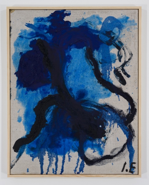
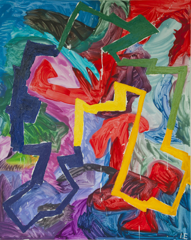
Norwegian artist Ida Ekblad just finished her solo exhibition at the Museum of Contemporary Art Oslo this week. In the official press release her work  is referred to as being “frequently process oriented and her artistic practice is often described as spontaneous and chance-based.  Items seemingly discarded on scrapheaps as worthless are given new meaning through recycling in a work of art with other qualities and connotations. Her works oscillate between an unrestrained imagination and her familiarity with, and allusions to, an art-historical tradition.”

For this exhibition, Ekblad used the museum as her studio, producing more than 30 works in situ. These new works improvise a performative architecture out of industrial debris, found objects and shopping carts. Reference to John Chamberlain and Anthony Caro can be noted as Ida Ekblad present her version of scrap-hunting sculpture. As the shopping charts where rolled onto canvas and paint, each shopping chart has  its own specific painting which is displayed later as a series of large scale paintings along the walls.

Also exhibited was Ekblad’s paintings of the past five years, in particular, are courageous demonstrations of the relevance and feasibility of an expressive artistic gesture. She works in a variety of media. Painting, sculpture, installation, performance, and poetry, simultaneously and without hierarchical distinction.

Ekblad works in a process-oriented manner, and her approach is often described as spontaneous and fearless. She creates installations, sculptures and collage- and assemblage-like pieces from fragments and objects that she finds along the roadside and at construction sites nearby the places she is working. Things that have apparently lost their value and been thrown away often acquire a new meaning by being re-used in a work of art imbued with other qualities and connotations.

Ida Ekblad (b. Oslo, 1980; lives and works in Oslo) is educated at the Oslo National Academy of the Arts, 2007, and at the Mountain School of Arts, Los Angeles, USA, 2008. Still an emerging artist, Ekblad has already received international recognition participating in museum exhibitions around the world.

The exhibition is a collaboration between the National Museum in Oslo, Kunstmuseum Luzern and De Vleeshal, Middelburg. It is accompanied by a 160-page catalogue published by Distanz Verlag, Berlin, with poems by Ida Ekblad and contributions by Fanni Fetzer, Andrea Kroksnes, Quinn Latimer, and Barry Schwabsky.

Nasjonalmuseet presents Ida Ekblad’s first extensive museum exhibition. The exhibition continues the museum’s series showcasing younger Norwegian contemporary artists.

Read Full Article

Lynda Benglis

Lynda Benglis Peacock 004

benglis-ghost-dance

Lydia Benglis, Merak, Sinc and Copper, 1990 and Ghost Dance, Bronze and gold leaf, 1992

Lynda Benglis (born October 25, 1941) is an American sculptor known for her wax paintings and poured latex sculptures. After earning a BFA from Newcomb College in 1964, Benglis moved to New York, where she lives and works today. Benglis’ work is noted for an unusual blend of organic imagery and confrontation with newer media incorporating influences such as Barnett Newman and Andy Warhol. Her early work used materials such as beeswax before moving on to large polyurethane pieces in the 1970s and later to gold-leaf, zinc, and aluminum. The validity of much of her work was questioned until the 1980s due to its use of sensuality and physicality.

Like other artists such as Yves Klein, Benglis’ mimicked Jackson Pollock’s flinging and dripping methods of painting. Works such as Fallen Painting (1968) inform the approach with a feminist perspective. For this work, Benglis smeared Day-Glo paint across the gallery floor invoking “the depravity of the ‘fallen’ woman” or, from a feminist perspective, a “prone victim of phallic male desire”. These brightly colored organic floor pieces were intended to disrupt the male-dominated minimalism movement with their suggestiveness and openness. In 1971, Benglis began to collaborate with Robert Morris, creating Benglis’ video Mumble (1972) and Morris’ Exchange (1973). Benglis produced several videos during the 1970s in which she explored themes of self-representation and female identity.

Like other female artists, she was attracted by the newness of a medium that was uncorrupted by male artists. The structure of the new medium itself played an important role in addressing questions about female identity in relation to art, pop culture, and dominant feminism movements at the time. Benglis produced several videos during the 1970s in which she explored themes of self-representation and female identity.

Benglis felt underrepresented in the male-run artistic community and so confronted the “male ethos” in a series of magazine advertisements satirizing pin-up girls and Hollywood actresses. Benglis chose the medium of magazine advertisements as it allowed her complete control of an image rather than allowing it to be run through critical commentary. This series culminated with a particularly controversial one in the November 1974 issue of Artforum featuring Benglis aggressively posed with a large latex dildo and wearing only a pair ofsunglasses promoting an upcoming exhibition of hers at the Paula Cooper Gallery. One of her original ideas for the advertisement had been for her and collaborative partner Robert Morris to work together as a double pin-up, but eventually found that using a double dildo was sufficient as she found it to be “both male and female.”

Read Full Article

Galleries: Giò Marconi, Milano

gallery gio marconigallery gio marconi

Installation view: John Bock, Barlach, 2010, Giò Marconi Gallery, Milano

Gallery Giò Marconi, Milano started in 1990 under the initiative of Giò Marconi who created the Studio Marconi 17, an experimental space for young artists and art critics that he directed from 1986 to 1990. At the beginning, the new gallery was directed by Giò and his father Giorgio, who founded the Studio Marconi (1965-1992); now Giò Marconi gallery mainly focuses on contemporary positions and, at the same time, continues to include historical artists of the Studio Marconi into its programme.

Giò Marconi is interested in the works of the European and international avant-garde, showing artists such as Franz Ackermann, John Bock, Matthew Brannon, Nathalie Djurberg, Wade Guyton, Christian Jankowski, Sharon Lockhart, Michel Majerus, Jonathan Monk, Jorge Pardo, Paul Pfeiffer, Tobias Rehberger, Markus Schinwald, Dasha Shishkin, Elisa Sighicelli, Thaddeus Strode, Catherine Sullivan, Vibeke Tandberg, Grazia Toderi, Atelier Van Lieshout, Francesco Vezzoli, Christopher Wool. From 1965 until now shows by the following artists have been reaized by the Studio Marconi and Giò Marconi gallery: Valerio Adami, Enrico Baj, Georg Baselitz, Joseph Beuys, Peter Blake, Alighiero Boetti, Alberto Burri, Alexander Calder, Anthony Caro, Enrico Castellani, Patrick Caulfield, Mario Ceroli, Marc Chagall, Christo, James Coleman, Gianni Colombo, Willem de Kooning, Sonia Delaunay, Lucio Del Pezzo, Antonio Dias, Bruno Di Bello, Piero Dorazio Lucio Fontana, Sam Francis, Richard Hamilton, David Hockney, Hsiao Chin, Anselm Kiefer, Martin Kippenberger, Franz Kline, Lee U Fan, Man Ray, Giuseppe Maraniello, Joan Mirò, Maurizio Mochetti, Aldo Mondino, Francois Morellet, Keizo Moroshita, Ugo Mulas, Louise Nevelson, Helmut Newton, Gastone Novelli, Giulio Paolini, Gianfranco Pardi, H.P.Paris, A.R.Penck, Francis Picabia, Pablo Picasso, Arnaldo Pomodoro, Mimmo Rotella, Mario Schifano, Daniel Spoerri, Aldo Spoldi, Emilio Tadini, Antoni Tapies, Herve Telemaque, Joe Tilson, Giuseppe Uncini, Emilio Vedova, Tom Wesselman, William T.Wiley.

Gio Marconi via Tadino 15 I-20124 Milan Italy

Read Full Article

Artist: Nikolas Gambaroff

Artist Nikolas Gambaroff

Artist Nikolas Gambaroff

Nikolas Gambaroff, Untitled, 2011 and exhibition view of Tools for Living, 2012

Artist Nikolas Gambaroff work questions the process of painting and its support structures by deconstructing and re-evaluating traditional methods of production and display.

As Gambaroff himself puts it, “In my work I try to dissect, deconstruct, and re-evaluate (mainly within the limits of the activity painting) the customs, expectations and myths that painting as part of our visual culture brings along.”
Works that ostensibly echo the age-old impetus of subjective self-expression are, therefore, conceived as platforms through which to question notions of authorship, distribution and exposition alongside issues such as the social and economic value of art itself.

In addition, Gambaroff’s “staging of the space that a viewer experiences painting in” is designed less to highlight interplay amongst the works themselves, than focus particularly on “the problems of support structures in art (material/architectural but also ideological).”
The introduction of elements from ‘outside’ the traditional compass of painting provides further opportunities to deconsecrate and demystify painterly production in order to debate the mechanisms that confer artistic status.

Read Full Article

R. H. Quaytman

Quaytman2
R. H. Quaytman

Installation view, R.H Quaytman, Institute of Contemporary Art Boston, 2009 and Chapter 12: iamb (checkered blue screen with edges), 2008, Oil, silkscreen, gesso on wood, 51 x 82.2 cm

R. H. Quaytman is a contemporary artist, best known for paintings on wood panels, using abstract and photographic elements in site-specific “Chapters”, now numbering twenty-five. Each Chapter is guided by architectural, historical and social characteristics of the original site. Since 2008, her work has been collected by a number of modern art museums.She is also an educator and author, and is based in New York City.

She received a BA from Bard College in 1983 and attended the Post-Graduate program in painting at the National College of Art & Design in Dublin, Ireland in 2001 and later attended the Institut des Hautes Études en Arts Plastiques in Paris to study with Daniel Buren and Pontus Hultén.

She is a Rome Prize recipient and attended the Institute des Haute Etudes in Paris. R.H. Quaytman incorporates optical abstractions, silkscreened photographs, diamond dust layers, and hand-painted trompe l’oeil elements into her works. In 2011, her painting was on the cover of Artforum magazine, with an essay by Paul Galvez describing her international triumvirate of installations in the past three years

Read Full Article

Exhibition: John McCracken, Works from 1963-2011, David Zwirner, New York

john mccracken artistjohn mccrackenmccracken_installation

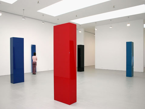
John McCraCken, Untited Sculptures, Installation Views

John McCraCken, Works from 1963–2011, 10 September – 19 October, 2013
David Zwirner, 537 West 20th Street, New York

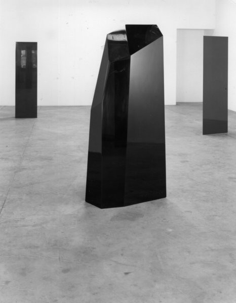
McCracken occupies a singular position within the recent history of American art, as his work melds the restrained formal qualities of Minimalist sculpture with a distinctly West Coast sensibility expressed through color, form, and finish. He developed his early sculptural work while studying painting at the California College of Arts and Crafts in Oakland in the late 1950s and early 1960s. While experimenting with increasingly three-dimensional canvases, the artist began to produce objects made with industrial materials, including plywood, sprayed lacquer, and pigmented resin, creating the highly reflective, smooth surfaces that he was to become known for.

Drawn primarily from public and private collections, the approximately fifty works in this exhibition chart the evolution of McCracken’s diverse but considered oeuvre. Encompassing both well-known and lesser-seen examples of the artist’s production from the early 1960s up through his death in 2011.

Highlights from the exhibition include a room-size installation of six monumentally scaled black columns, a layout introduced by the artist in his sketchbook in the early 1970s, but first produced and shown at David Zwirner in 2006; as well as an adjacent room containing stainless steel sculptures from 2011, which are polished to produce such a high degree of reflectivity that they seem translucent and camouflaged, bordering on invisibility as they reflect their surroundings.

A number of works from the 1960s, when McCracken first emerged onto the Los Angeles art scene, are included in the exhibition, such as Untitled (1964), a cross-shaped hybrid form that vacillates between painting and sculpture; three multi-colored rectangular “slot” works, a form that McCracken first exhibited in his seminal 1965 solo show at Nicholas Wilder Gallery in Los Angeles; as well as several of the artist’s earliest “planks,” his signature sculptural form that he first generated in 1966 and continued to make throughout his career. These narrow monochromatic, rectangular board-shaped sculptures lean against the wall while simultaneously entering into the three-dimensional realm of the viewer. Also on view is Untitled (2011), the last plank that McCracken made in his lifetime, which is fabricated in stainless steel.

In 2015, the Orange County Museum of Art in Newport Beach, California will host a retrospective of McCracken’s work.

Read Full Article

Kader Attia, on the Culture of Fear and the Construction of Evil

Kader Attia Artist

Kader Attia Artist

Kader Attia, Dé-construire/Ré-inventer, 2012 and  Inspiration/ Conversation, 2010

Kader Attia (Berlin) on the Culture of Fear and the Construction of Evil, with guest Lotte Arndt (writer and journalist, Paris) and Ana Teixeira Pinto (writer, Lisbon).

How has the once idealized figure of the “wild man” (promoted by authors such as Jean-Jacques Rousseau, who proclaimed that “man is naturally good, society corrupts him”) turned into an evil counterpart of the Western colonial gaze through the agenda of the newspaper presses of the early 20th century?

With the ownership of the American continent, the Renaissance marked the beginning of modern colonialism. European’s encounters with American Indians prompted heated theological debates, such as the infamous Valladolid Controversy (Spain, 1550–1551), which questioned whether the indigenous beings had a soul. Their practice of human sacrifice, seen as an act of evil, de facto deprived native peoples of the status of free men.

A booming newspaper industry of the nineteenth century was the privileged stage from which to question the relationship between the West and non-Western cultures. Newspapers’ visual representations of the latter were dominated by a depiction of the menacing figure of the “wild man,” a dark and brutal alter ego of the modern Western male. Represented as a beast or monster, the wild man became the center of pro-colonial propaganda and its civilizing mission. Such representations were the source of a popular visual propaganda, disseminated throughout the Western press, and served to shape nationalist, Eurocentric worldviews that perpetuate today. Now, this fallacious hegemony is finally being reassessed in the West, creating a genealogy of how such representations can provide an important step to further challenging the views of the West towards extra-occidental cultures.

The Culture of Fear: A Construction of Evil is presented as part of The World Turned Inside Out over the course of the summer. It is the first installment of Attia’s ongoing project, which will culminate with its final presentation in The Crime Was Almost Perfect, a group exhibition curated by Cristina Ricupero at Witte de With Rotterdam in January 2014.

Read Full Article

Art: Ed Atkins, A Tumour (In English), 2010

Ed Atkins

Ed Atkins, A Tumour (in English), video still, 2010

London-based artist Ed Atkins interest in high definition makes him a rarity in a landscape of video artists who work with antiquated 35mm and 16mm. Digital film is innately mysterious – it’s data in a box – but Atkins turns it into stuff you feel under your skin and in your gut. His work has a violent poetry, not least in the texts that accompany the films. His Death Mask series includes a Madame Tussaud film script ripe with gruesome details about the famed wax-sculptor’s trade in guillotined corpses. The body, illness and death are all major themes.

A Tumour (In English), is a case in point. Electronic blurs and booms, crazy drum rolls and bass thrums complement footage and special effects that conjure domes, moons, black spots and a wet red wrinkled orb that might be a cancerous blood cell. An animated digital mouth asks in a drugged, ominous voice: “Would you mind checking the mole on my shoulder? … Will you take a look, son?” before describing the “lonely juices bubbling beneath the crust”, “bone marrow, browned in the air”, and other haikus of bodily horror. In an accompanying book, the detail is relentless. It even promises to “conjure a tumour inside you”. Who says art can’t have a real-world impact?

Cadavers play a complicated role in Atkins’s work. Decaying bodies – smelly, soiled and solid; not to mention loaded with memories of those they leave behind – could not be further from the weightless digital realm. Yet he makes a ferocious attempt at closing the gap, pushing video and audio to visceral new extremes.

Read Full Article

Exhibition: Paul McCarthy, WS, Park Avenue Armory, New York

Paul McCarthy White Snow

Paul McCarthy White Snow

Paul McCarthy, WS, Exhibition View, 2013

Paul McCarthy, WS, 19 June – 4 August, 2013
Park Avenue Armory, New York

McCarthy is using Disney’s Snow White, turning her into his White Snow, as a character she is readymade emotional architecture dressed as an impossibly beautiful group of images. The largest installation yet for the artist, WS took 72 semi-trucks to transport from the artist’s studio in Los Angeles to New York, where 38 people worked for about a month to install it in the Armory’s Wade Thompson Drill Hall. The artist’s son, Damon McCarthy, was among 120 people who worked on several films tied to the project.

Walt Paul is Mr. McCarthy’s character in the large-scale exhibition at the Armory, where the artist has installed a “forest” featuring 30-foot trees, oversize plants and flowers, and a three-quarter-scale replica of his childhood home. Video screens hung from the ceiling surrounding the installation show a series of 10 video projections of performances from a recent party at the house, which quickly gets out of hand. McCarthy plays Paul Walt, an amalgamation of himself and Walt Disney, who is embroiled in various psychosexual scenarios with White Snow: he cries as she asks him about doing his homework; he shoves a boom mic into her mouth; she covers his face with ketchup, etc. There is a very sad sequence where he follows her through the forest at night, howling, crying, falling down. The dwarfs dine on chicken and Red Bull, get drunk and descend into debauchery.

Tucked into a room at the entrance of New York’s Park Avenue Armory,  is a fully functional souvenir store overrun by Snow White. The artist has arranged 1,500 pieces of Disney memorabilia on countertops and in glass display cases. A small stuffed Snow White doll costs $75, a Snow White costume $350 and a large figurine of the princess dining with her dwarf cohort $10,000.

The Los Angeles-based Mr. McCarthy purchased most of the pieces, many of which are real Disney products, online from secondary sources like eBay, gallery representatives say.

The shop is part of the exhibition, and all profits go toward offsetting the overall cost of the show (which includes the funds used to acquire the knickknacks and staff the shop). Mr. McCarthy signed the pieces “Walt Paul,” a combination of his name and Walt Disney’s, in black somewhere on each of the items. Disney declined to comment on the exhibition.

Representatives at the armory say the Snow White collectibles, the boxed princesses and stuffed dwarves, the Disney piggybanks and paper plates, are flying off the shelves. “There’s some humor” in the gift shop “and a sense of Americana,” says Rebecca Robertson, president and executive producer at the armory. Mr. McCarthy, she adds, is “playing with the concept of what is art” the way Andy Warhol or surrealist Marcel Duchamp did.

The exhibition has already drawn criticism for its explicit treatment of the classic fairy tale. Restricted to visitors over the age of 17, the show comes with disclaimers about its content.

Read Full Article

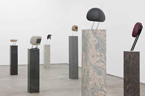
Nina Beier “HEAVY HAND” 2013

Nina BeierNina Beier

Nina Beier

Real Estate, view setup , 2013, Loulou , 2013 and Smokes , 2013

“Growing up in Los Angeles, I have spent a majority of my life in traffic, looking out the window watching disgruntled individuals make their way from point A to point B, then C, into eternity.  You find yourself staring at your reflection in the waxed surfaces of the cars next to you looking for some sense of purpose in the homogenized population of vehicles of the freeways (and in many ways not so free at all). As you continue your journey moving forward, you lean back, and rest your head.”  Statement written for “Heavy Hand” and exhibition by Nina Beier at Standard, in Oslo, Norway.

Of any artist working today, 35-year-old hyper-mixed-media artist Nina Beier is creating some of the boldest examples of the contemporary artwork in crisis mode. This has a lot to do with the unstable, in flux, usually-referencing-something-absent, often-crushed-or-pieced-together, and likely-to-change nature of her sculptural explorations.

The Danish-born Beier gets much of her creative impulses from philosophy and literature (Heidegger and Lewis Carroll are recent touchstones). But for all of the theoretical uplift, the end result is provocatively tactile. Her most recent productions include dipping photographic stock images in glue and hanging them to dry on mass-produced household items, thus using an image to utterly envelop an actual thing. Another series involves found secondhand fabrics stuffed together inside a frame to create an almost Arte Povera-esque surface on the verge of busting open.

Beier has been living in Berlin for the past three years after starting her career in London. “I moved mainly because I was attracted to the qualities of an underpopulated city,” she says. “I guess the pace of the city is a little slower than other cities I have lived in, but I find the contrary to be true when it comes to the productivity of artists who live here.”

Read Full Article

Ken Price Sculpture: A Retrospective, Metropolitan Museum of Art, New York

Ken Price Sculpture

Installation view: Ken Price Sculpture: A Retrospective, geometrics, 2013

Ken Price Sculpture: A Retrospective, June 18 – September 22, 2013
The Metropolitan Museum of Art, New York

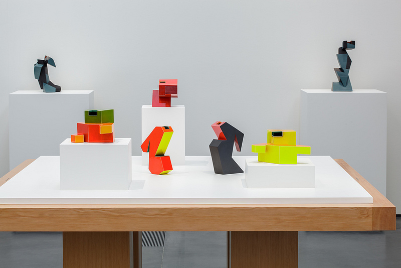
The first major museum exhibition of Ken Price’s work in New York, will trace the development of his ceramic sculptures with approximately sixty-five examples from 1959 to 2012. The selection range from the luminously glazed ovoid forms of Price’s early work to the suggestive, molten-like slumps he has made since the 1990s. In addition to the sculpture, the exhibition will feature eleven late works on paper by the artist. Price’s close friend, the architect Frank O. Gehry, designed the exhibition.

Price was born and raised in Los Angeles, California. Price’s earliest aspirations were to be an artist, “As far back as I can remember, I always wanted to be an artist. Even when I was a kid I would make drawings and little books, and cartoons..,” he states. Price enrolled in his first art ceramics course at Santa Monica City College in 1954, where he quickly embraced a formal craft tradition as espoused by Marguerite Wildenhain. He subsequently studied at the Chouinard Art Institute in Los Angeles, before receiving his BFA degree from the University of Southern California in 1956.

In the 1950s Price lived along the Pacific coastline, where his interest in surfing and Mexican pottery developed. During surfing trips in Southern California, Price and his friends, “always made a point of hitting the curio stores in [Tijuana], because they had great pottery. …just looking was a great education in earthenware pottery.” Price’s ceramic work at USC could be characterized as functional vessels derived from a folk pottery tradition.

Read Full Article

Artist: Josh Smith

Josh Smith Artist

josh-smith-artist

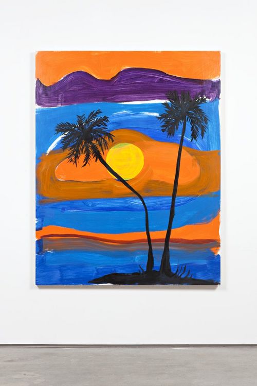
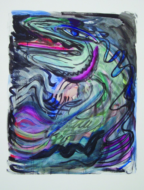
Josh Smith, Untitled, 2008 and Untitled, 2010. Mixed media on canvas, acrylic glass

Through paintings, collages, books, and ceramics, Josh Smith challenges the ideas of the artist. In forcing the painted image to be somewhat arbitrary, he has managed to take the act of painting beyond aesthetics.

Smith’s early training in printmaking is often the spur which drives his art making. Many of his paintings start with the artist’s name or a fish or leaf motif as a point of departure, but they typically eschew formal representation in favor of an exploration of abstraction. Other works, such as his palette paintings, are purely abstract and explore the notion of composition created by chance.
In his mixed media collages on plywood, subway maps, take-out menus, newspapers and street posters are combined with reproductions of Smith’s existing works as well as silk-screened text and original painting. Smith intersperses the manufactured with the handmade and elevates found materials by virtue of inclusion. He makes art so he can look at it.

Born in 1976, Josh Smith is from Knoxville, Tennessee. He has had numerous solo exhibitions. He lives and works in New York.

Read Full Article

Resort 2014: Christian Dior

Christan Dior Resort 2014 Raf SimonsChristan Dior Resort 2014 Raf Simons

Raf Simons for Christian Dior, Resort 2014, Paris

A dynamic forward movement for Dior. First and foremost, Simons was challenging himself, the way Miuccia Prada does with things she feels she has no natural instinct for. Lace, for instance, has never been part of Raf’s lingo. He didn’t want the history or the romance of the stuff, so he juxtaposed it against urgent striations of color in a dress that felt like gravity was dragging it sideways. He laid lace over a bandeau top and metallic tap shorts for a carelessly sporty effect, and he streaked lace dresses with fractured, angular graphics. But if there have been times in the past when Simons seemed like an arch iconoclast, what is increasingly coming through in his work with Dior is his ultimate respect for tradition. Why else would he try so hard to make it relevant for the new clientele that is being drawn to his clothes? So here there was a gorgeous cropped blouson with an abbreviated kimono sleeve, couture and casual in one compact package. As well as a floaty, peachy sundress in a satiny twill that wouldn’t have gone amiss on Grace Kelly, but Simons bifurcated it with a zip. “A symbol of sport and dynamism,” he said.

He’s always eulogized the movement of Christian Dior’s dresses, but here, at last, he acknowledged the restriction of those original looks, so there were zips everywhere. And aerodynamism. And asymmetry. One message came through loud and clear: release yourself. That timeless incentive amplified the notion that Raf Simons is about to take Dior on a long and glorious ride. Tim Blanks for Style.com

http://www.style.com/fashionshows/complete/slideshow/2014RST-CDIOR/#1

Read Full Article

Bookshop: Librairie des Archives, Paris

Librairie des Archives Bookshop
83 rue Vieille du Temple, 75003 Paris
info@librairiedesarchives.com, +33 (0) 142 721 358

Librairie des Archives is an independent bookshop in Paris specialising in fine art, decorative arts and design, fashion and jewelry.  The bookstore is located in the historic district of the Marais, close to Centre Pompidou, the Picasso museum (which is soon to be re-opened) and galleries such as Yvon Lambert (In witch also have a great bookstore).

The store is devoted to art of the 20th century. With his expertise and knowledge, the owner Stefan Perrier will advise you on his large collection of books, including exhibition catalogues, reference books, imports and a huge selection of out-of-print books.

Open Tuesday to Saturday 12.30 to 18.30

http://www.librairiedesarchives.com

Read Full Article